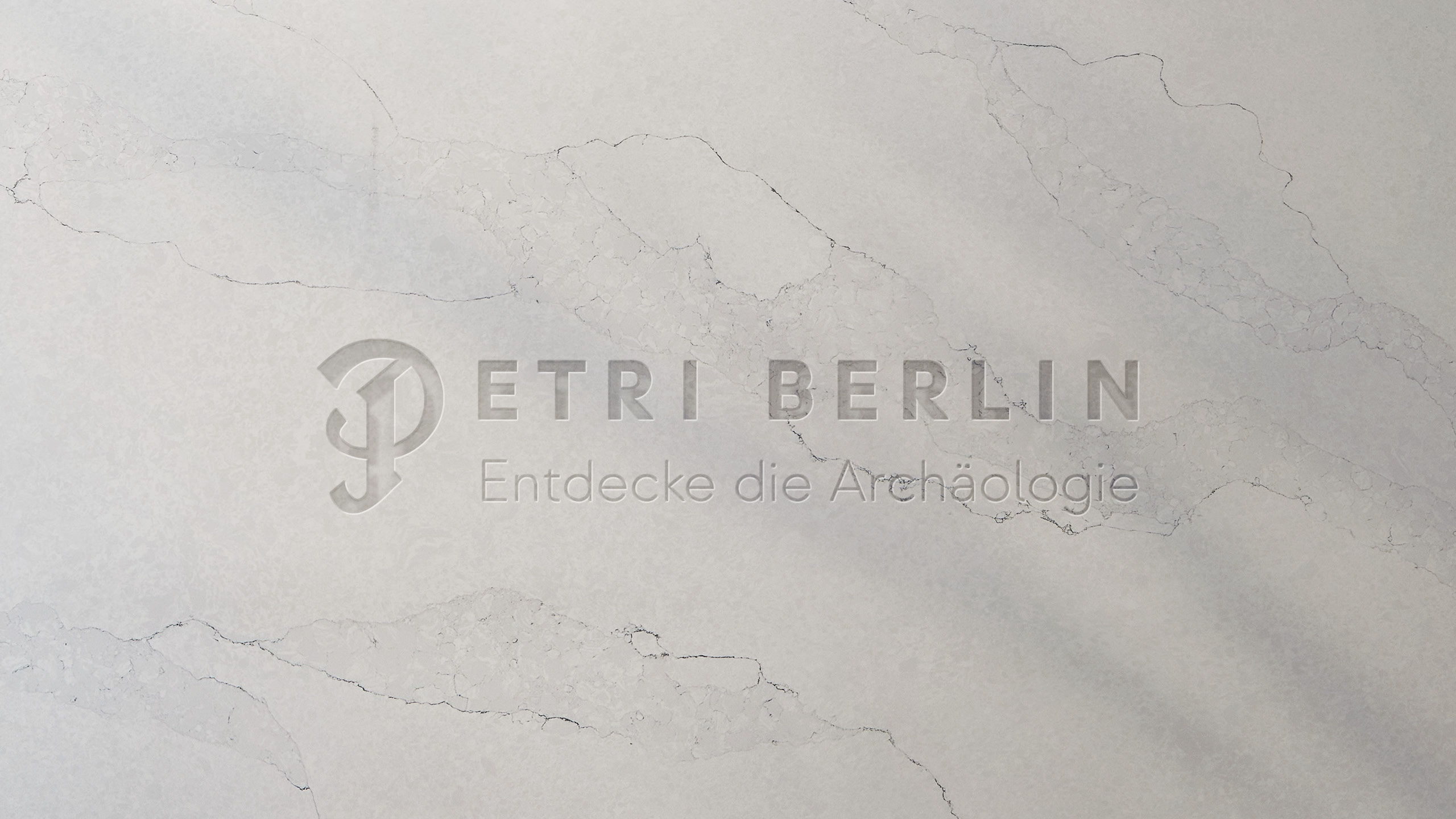
The place is the exhibit...
The concept of the place as an exhibit closely aligns with the exhibition concept. The focus is more on the discovery and development of the burial site rather than the mere exhibition. This approach is both a tribute to research and serves as a means of identity formation for the city of Berlin.
The place
is the exhibit...
The concept of the place as an exhibit closely aligns with the exhibition concept. The focus is more on the discovery and development of the burial site rather than the mere exhibition. This approach is both a tribute to research and serves as a means of identity formation for the city of Berlin.
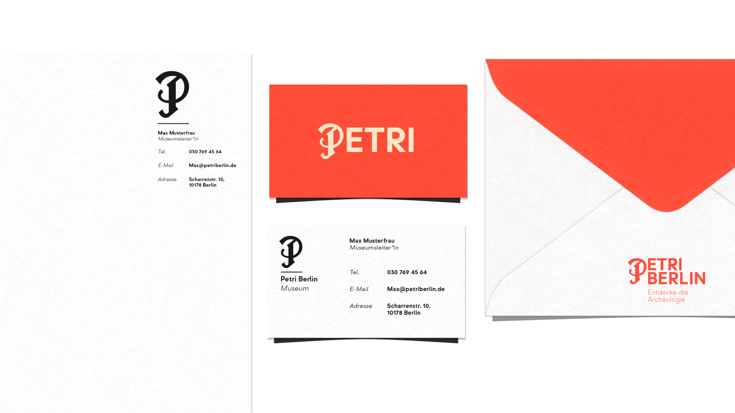
Work:
Client: Petri Berlin
Art Direction: Felix Kühl
Design: Felix Kühl
Motion Design: Liesa Schulz
Agency: Zentralnorden
Work:
Client: Petri Berlin
Copy: -
Art Direction: Felix Kühl
Agency: Zentralnorden
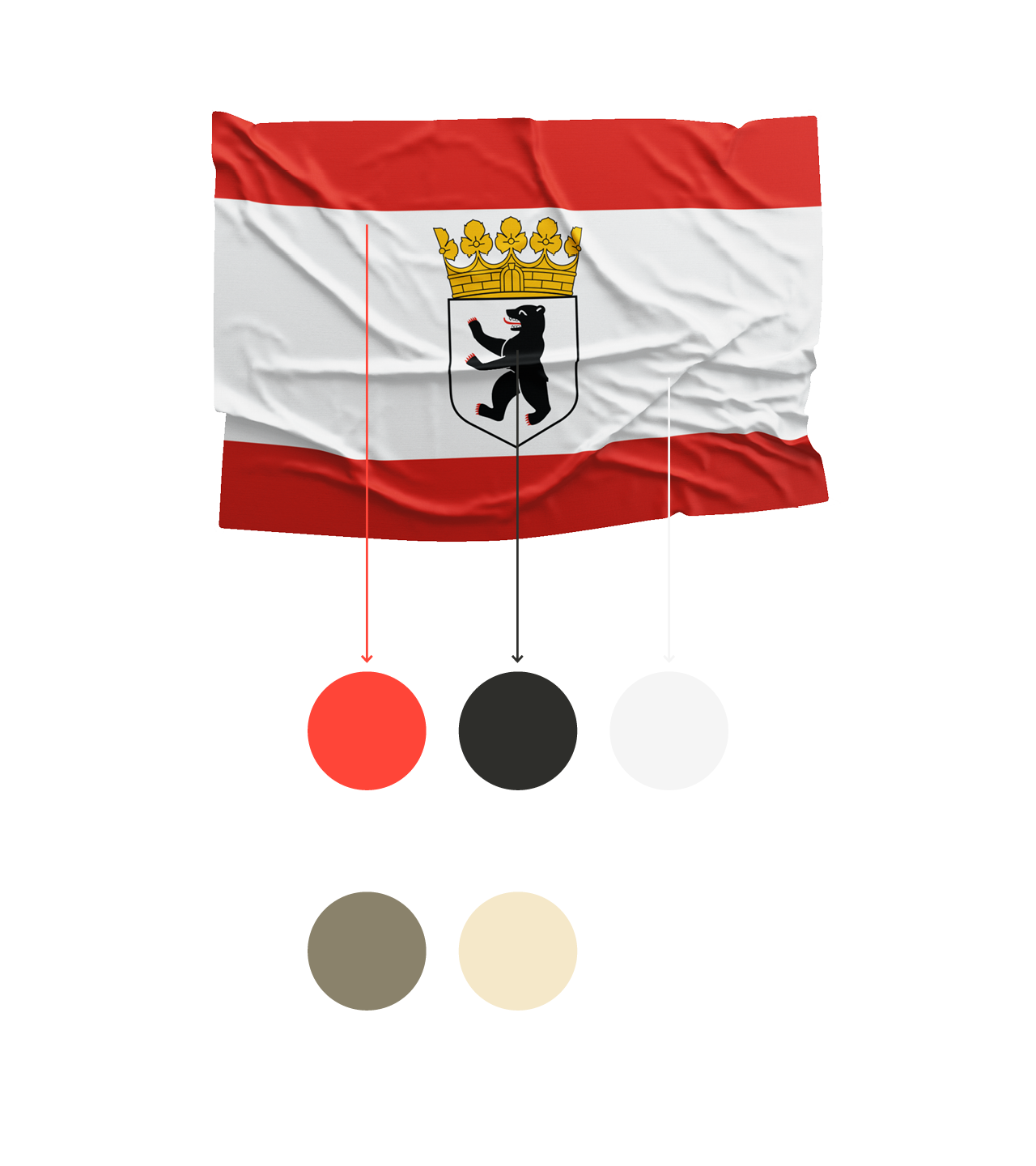
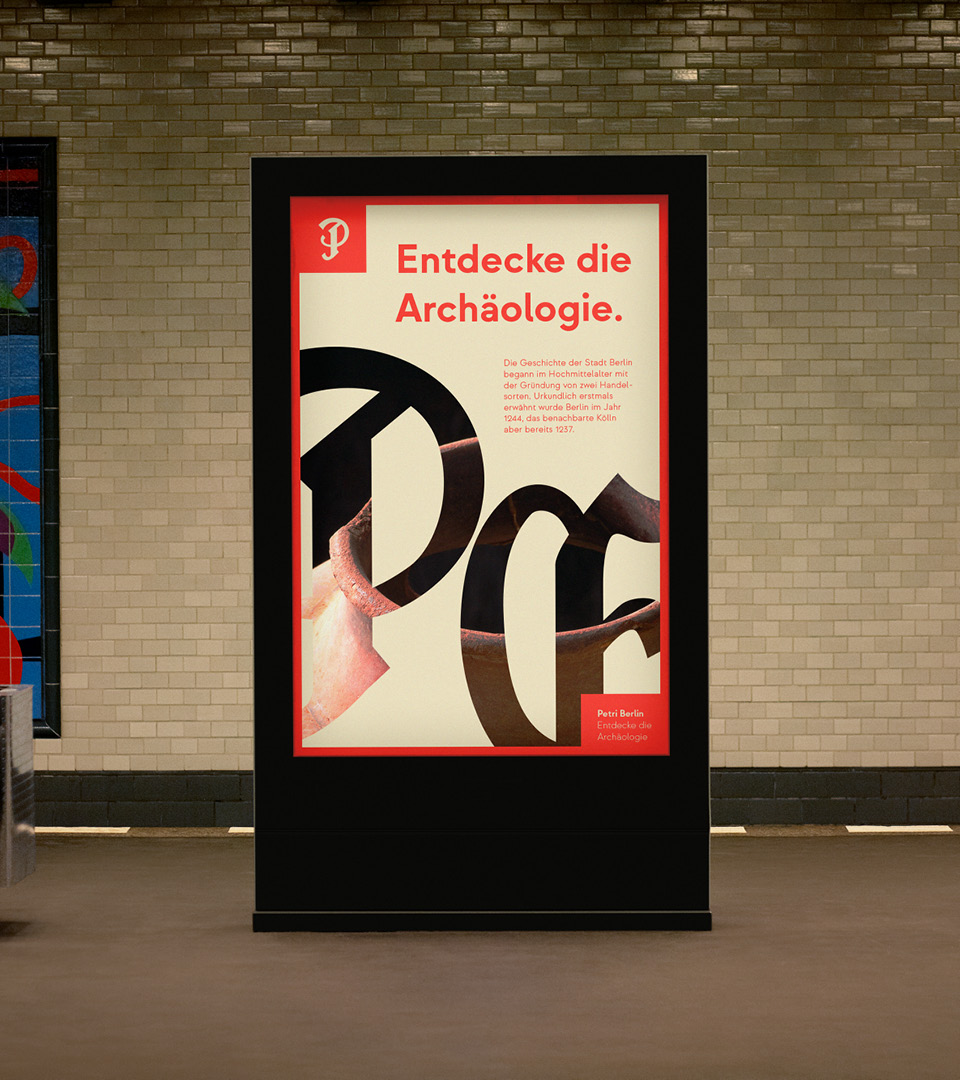
Color system
Color system
Classical roots.
Classical roots.
Classical roots.
The color concept is based on the Berlin flag to establish a connection to today's reality. The colors are slightly adjusted to better resonate with the historically significant location.
The color concept is based on the Berlin flag to establish a connection to today's reality. The colors are slightly adjusted to better resonate with the historically significant location.
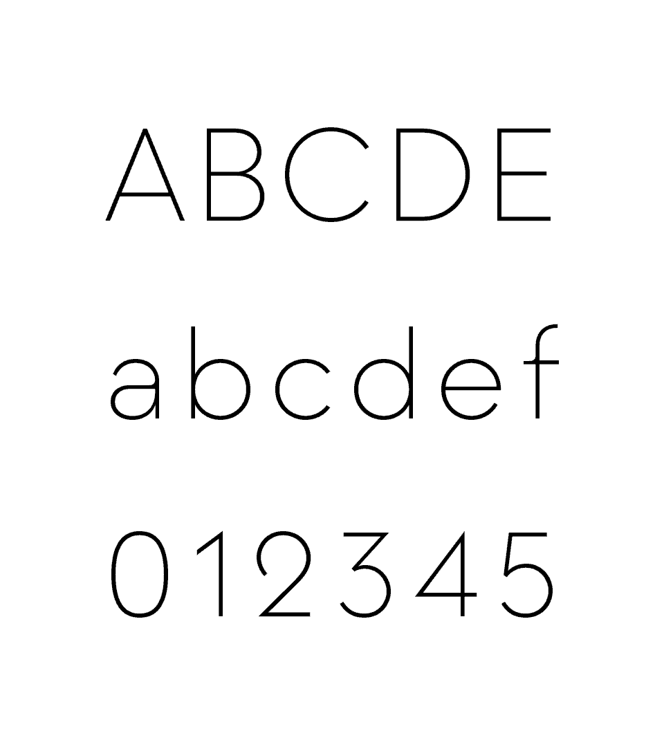
Typography
Typography
Typography
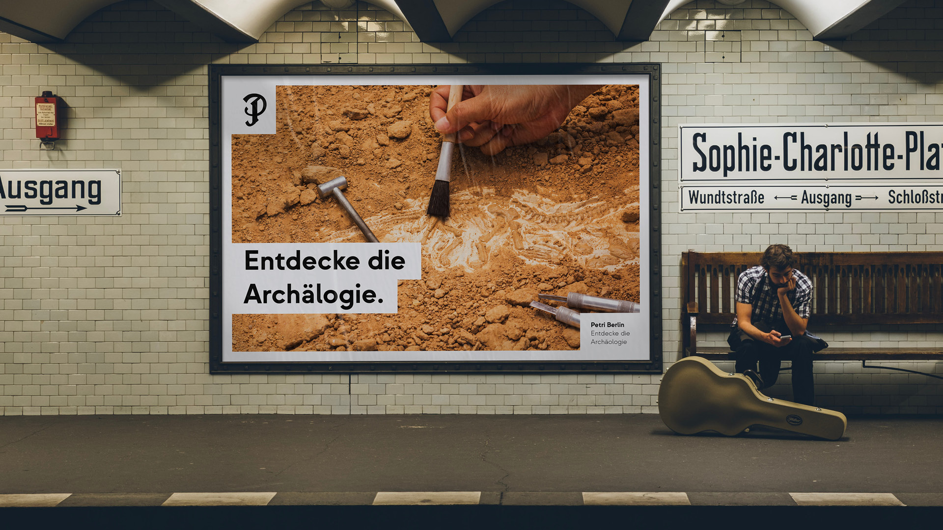
Clear as the excavation.
Clear
as the excavation.
Clear as the excavation.
The typography stands out with low contrast and a neo-geometric, minimalist design language. The perfect balance between width and height gives the branding a simple and clean appearance.
This approach is also reflected in the iconography.
The typography stands out with low contrast and a neo-geometric, minimalist design language. The perfect balance between width and height gives the branding a simple and clean appearance.
This approach is also reflected in the iconography.
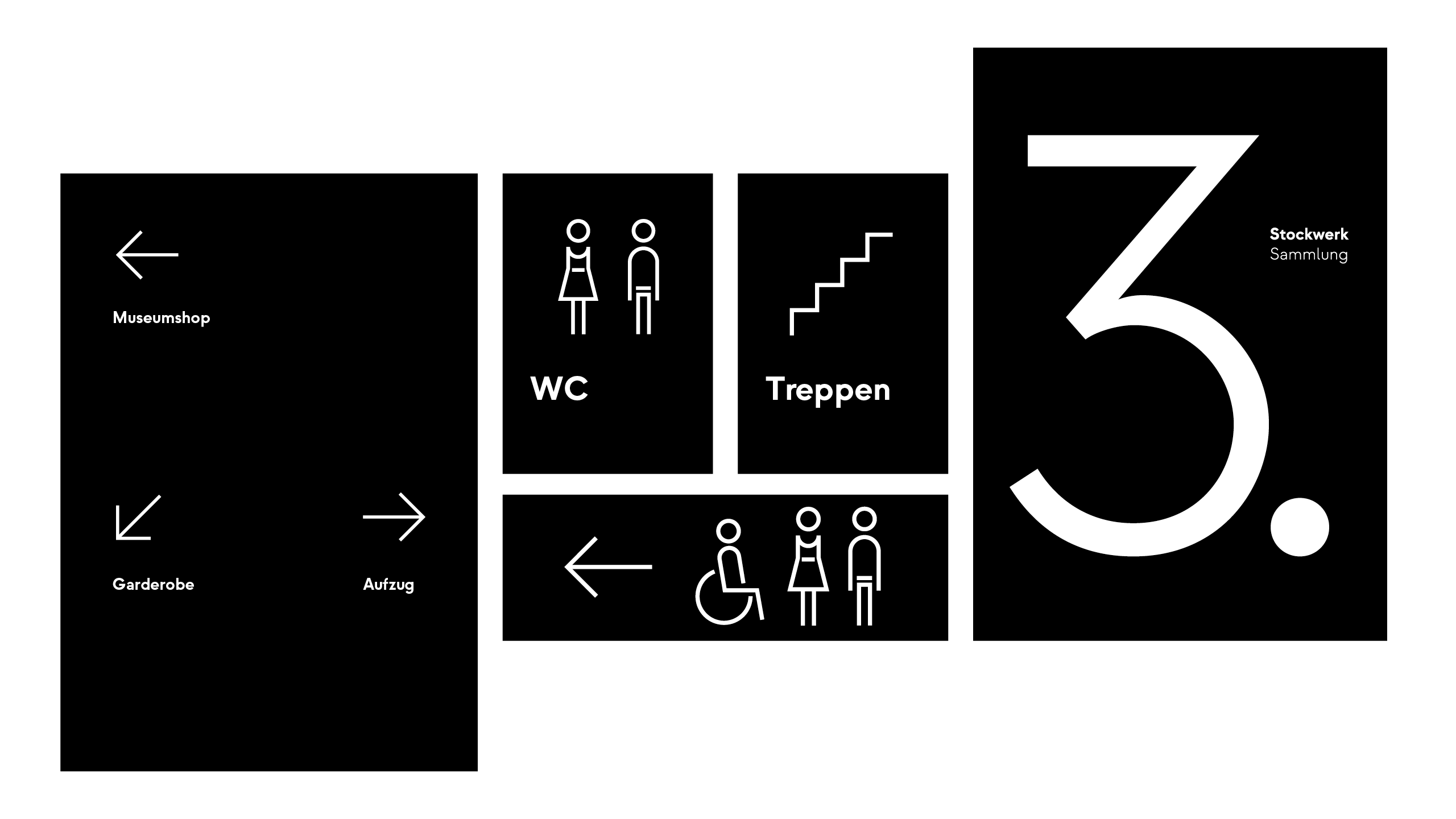
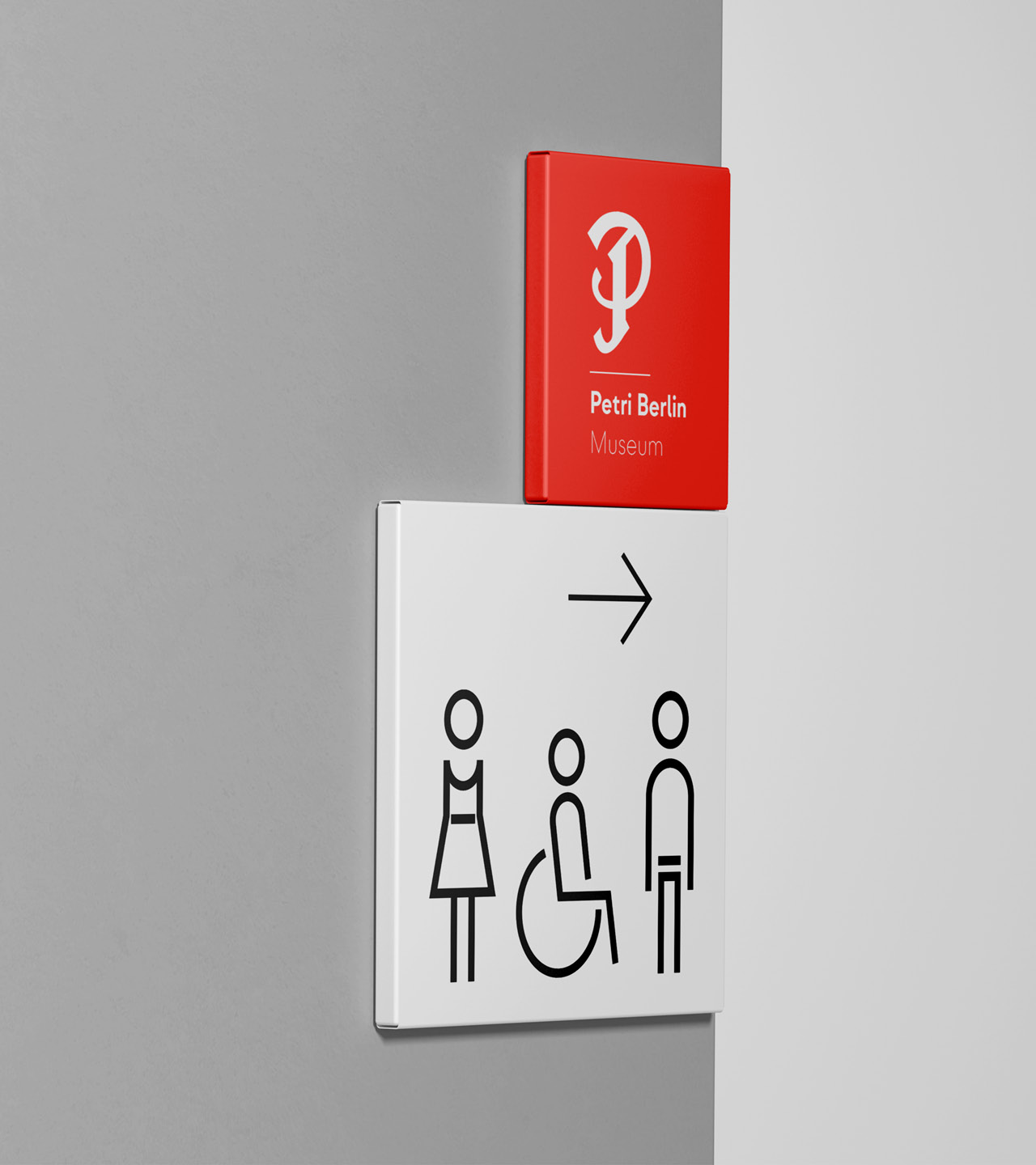
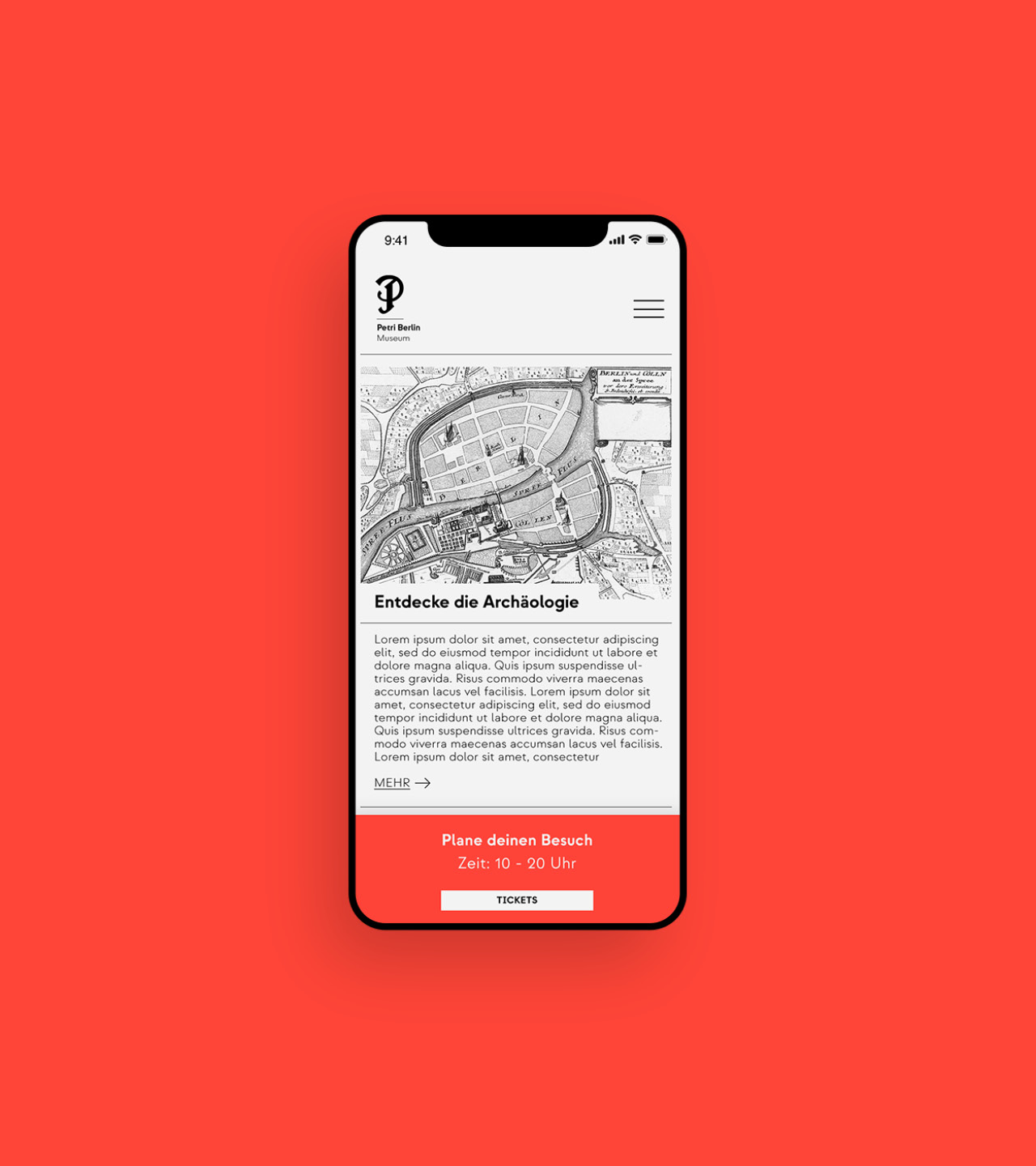
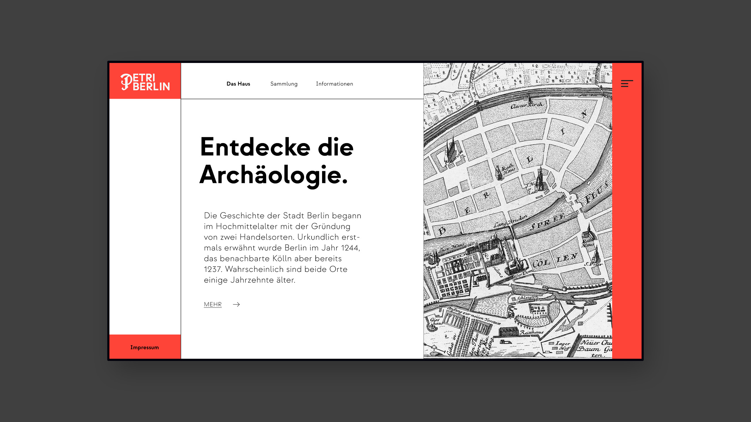
Typography and iconography shape both the signage in the physical space and various digital touchpoints.
Typography and iconography shape both the signage in the physical space and various digital touchpoints.
Typography and iconography shape both the signage in the physical space and various digital touchpoints.
Typography and iconography shape both the signage in the physical space and various digital touchpoints.
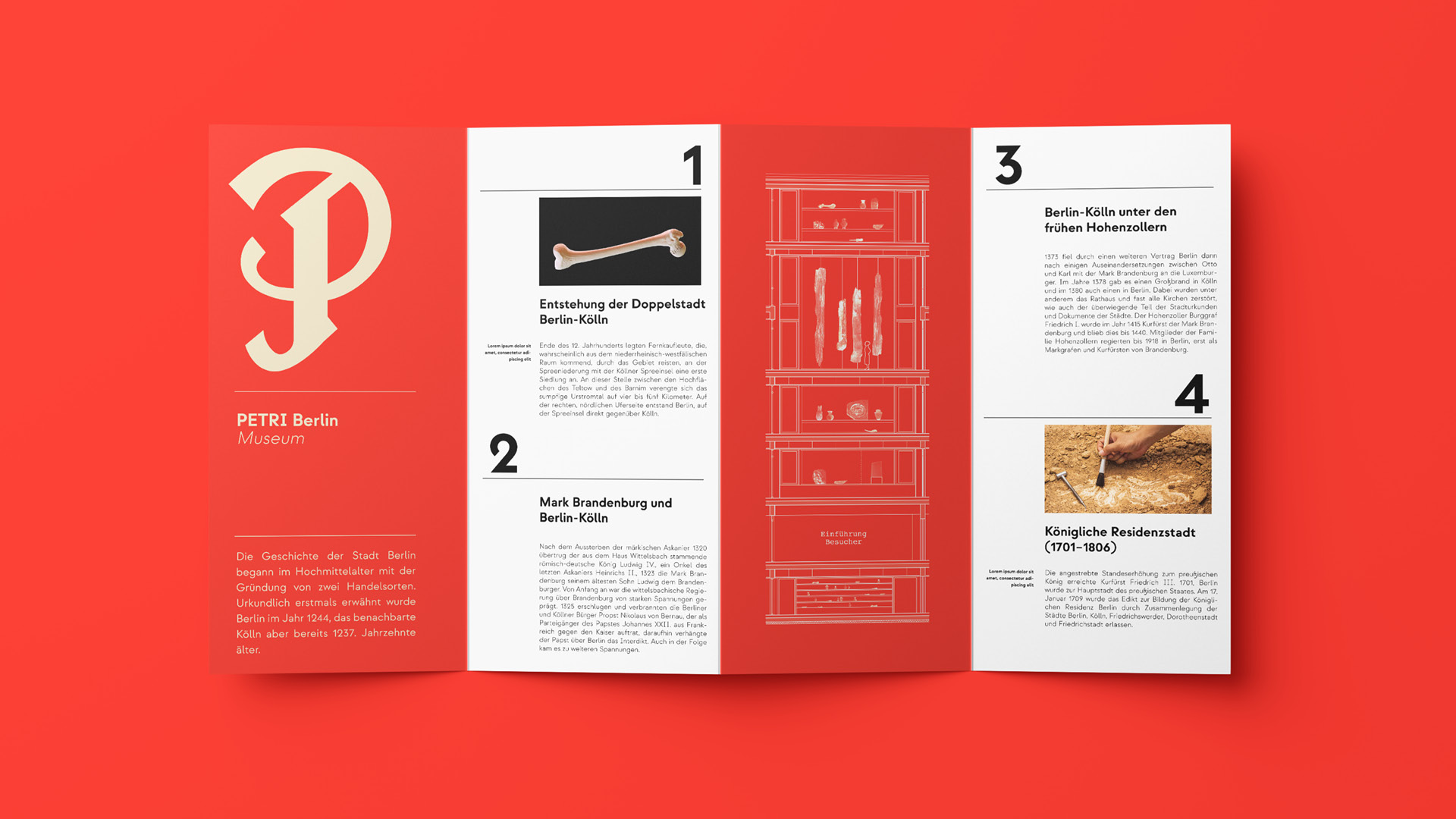
Layout
Layout
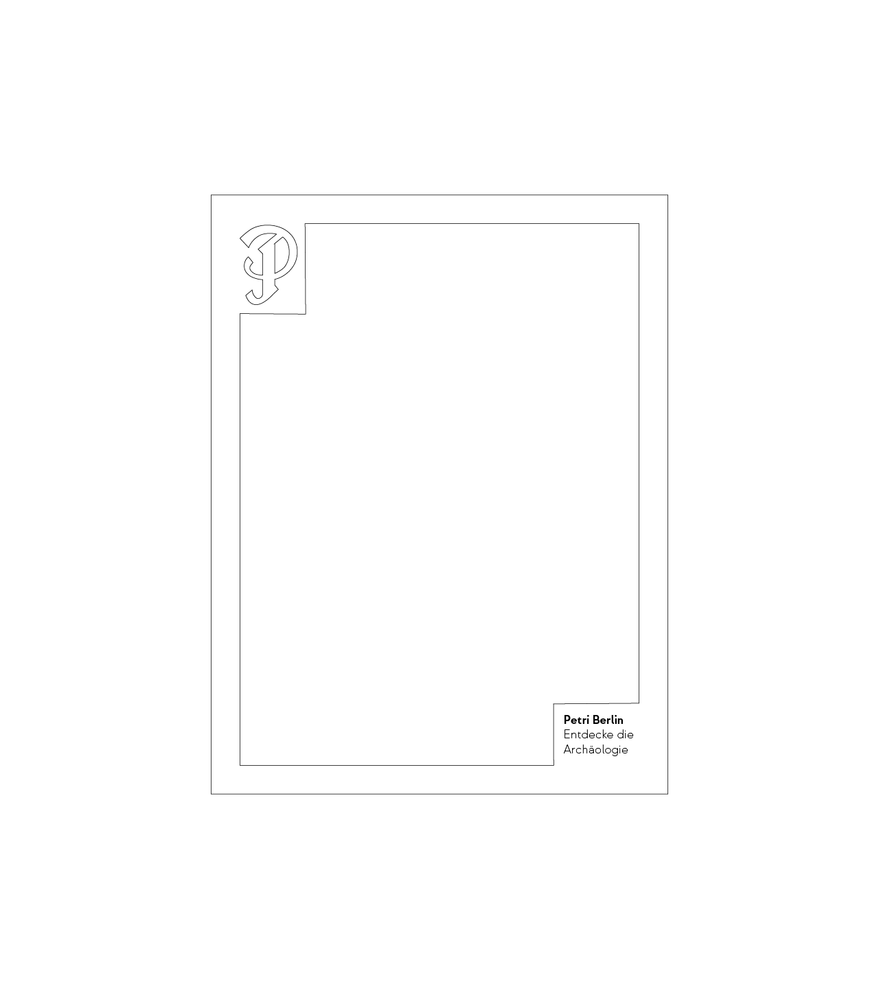
The classical book page.
The classical book page.
The classical book page.
The layout is inspired by a classical book page, featuring a prominent letter positioned in the top left corner. This layout is used consistently, whether the content is textual or more graphical in nature.
The layout is inspired by a classical book page, featuring a prominent letter positioned in the top left corner. This layout is used consistently, whether the content is textual or more graphical in nature.
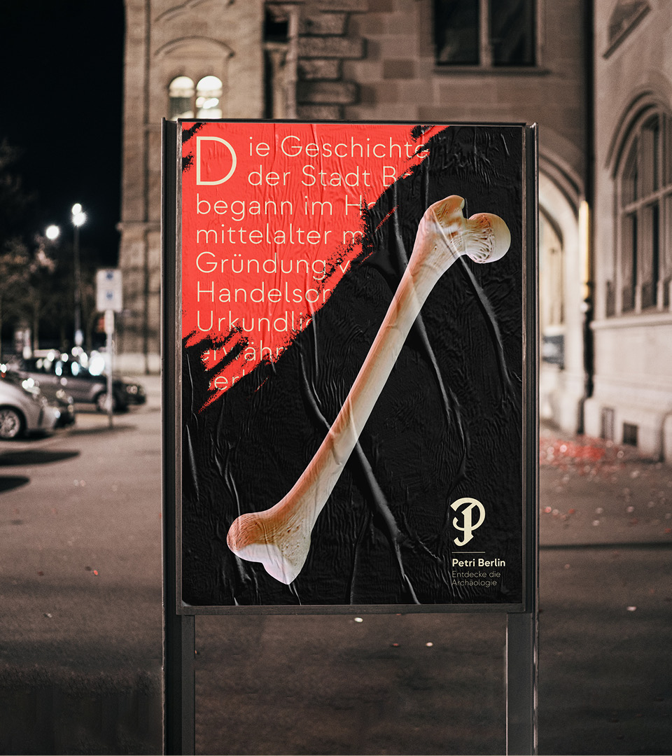
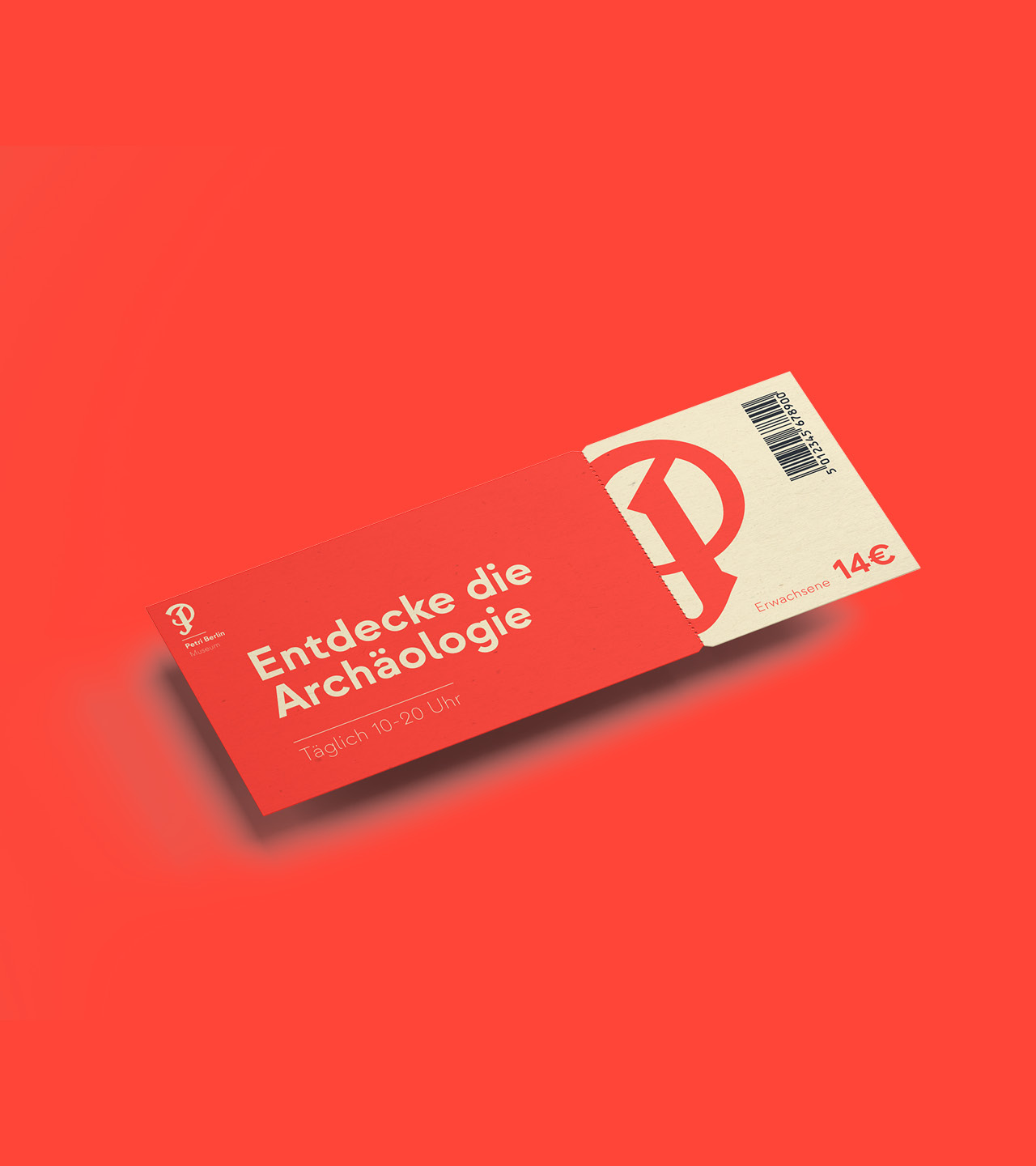
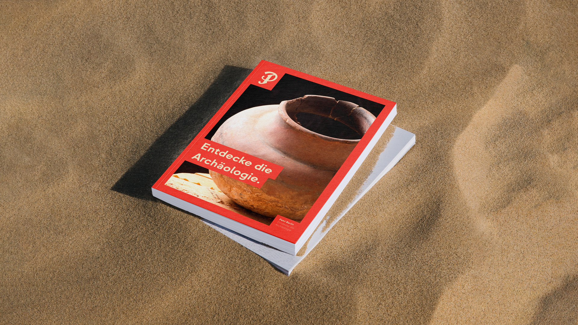
Printed matter
Loud.
Loud.
Loud.
Our house color red ensures the necessary eye-catching element to emphasize our printed matter and incidental expenses.
Our house color red ensures the necessary eye-catching element to emphasize our printed matter and incidental expenses.
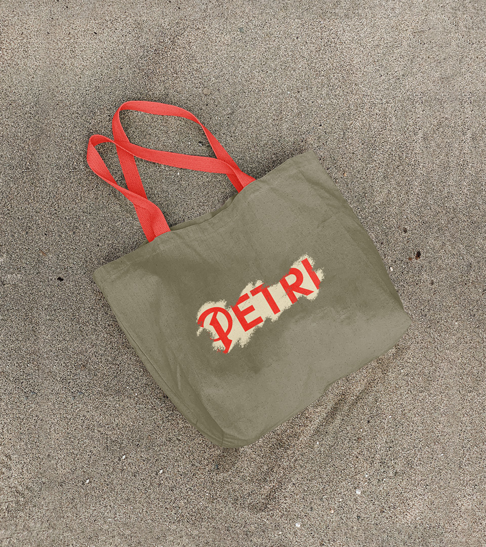
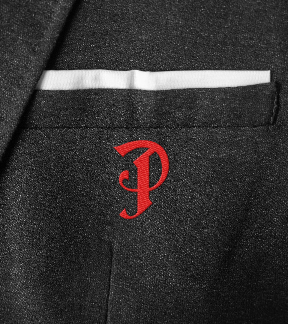
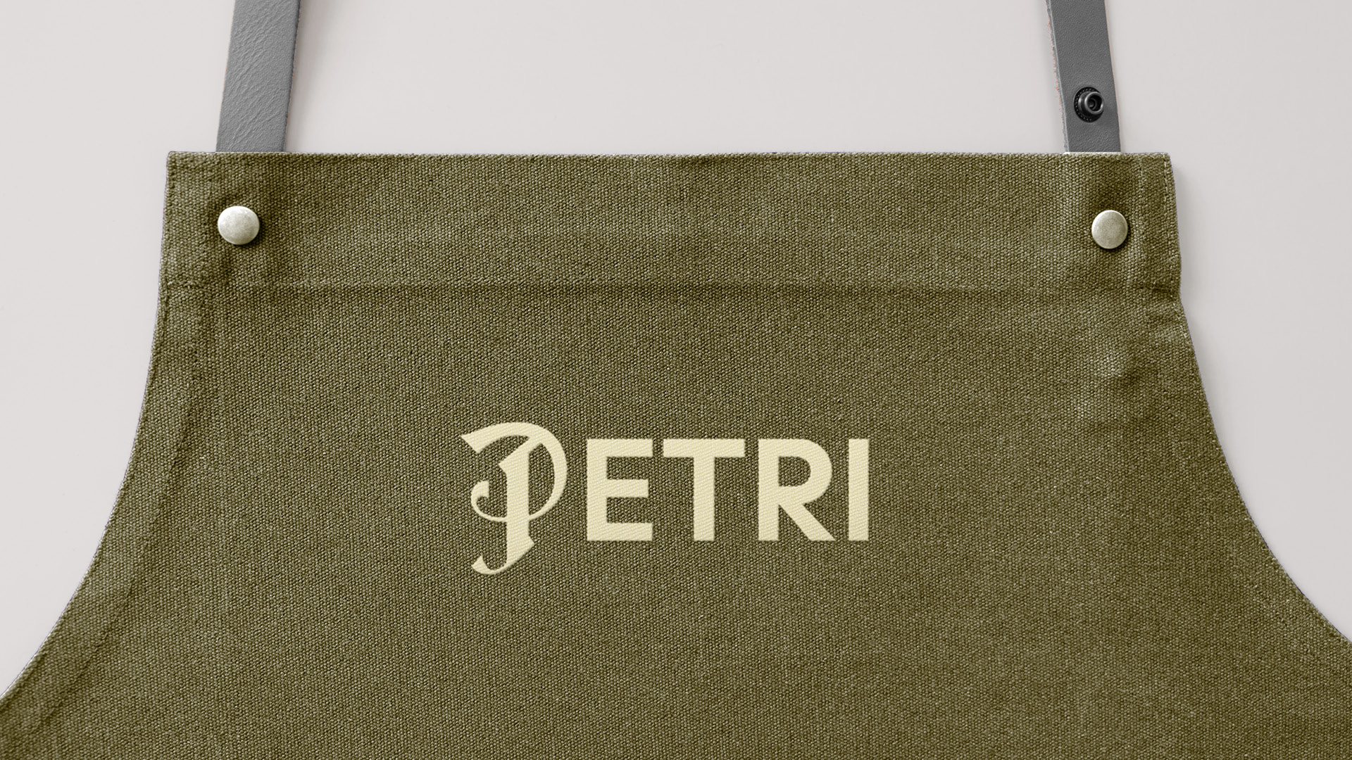
The logo can also be used for employee clothing. For this, we recommend using the secondary colors for optimal contrast.
The logo can also be used for employee clothing. For this, we recommend using the secondary colors for optimal contrast.

Want to create
something?
Want to create
something?