Spice up your socials...
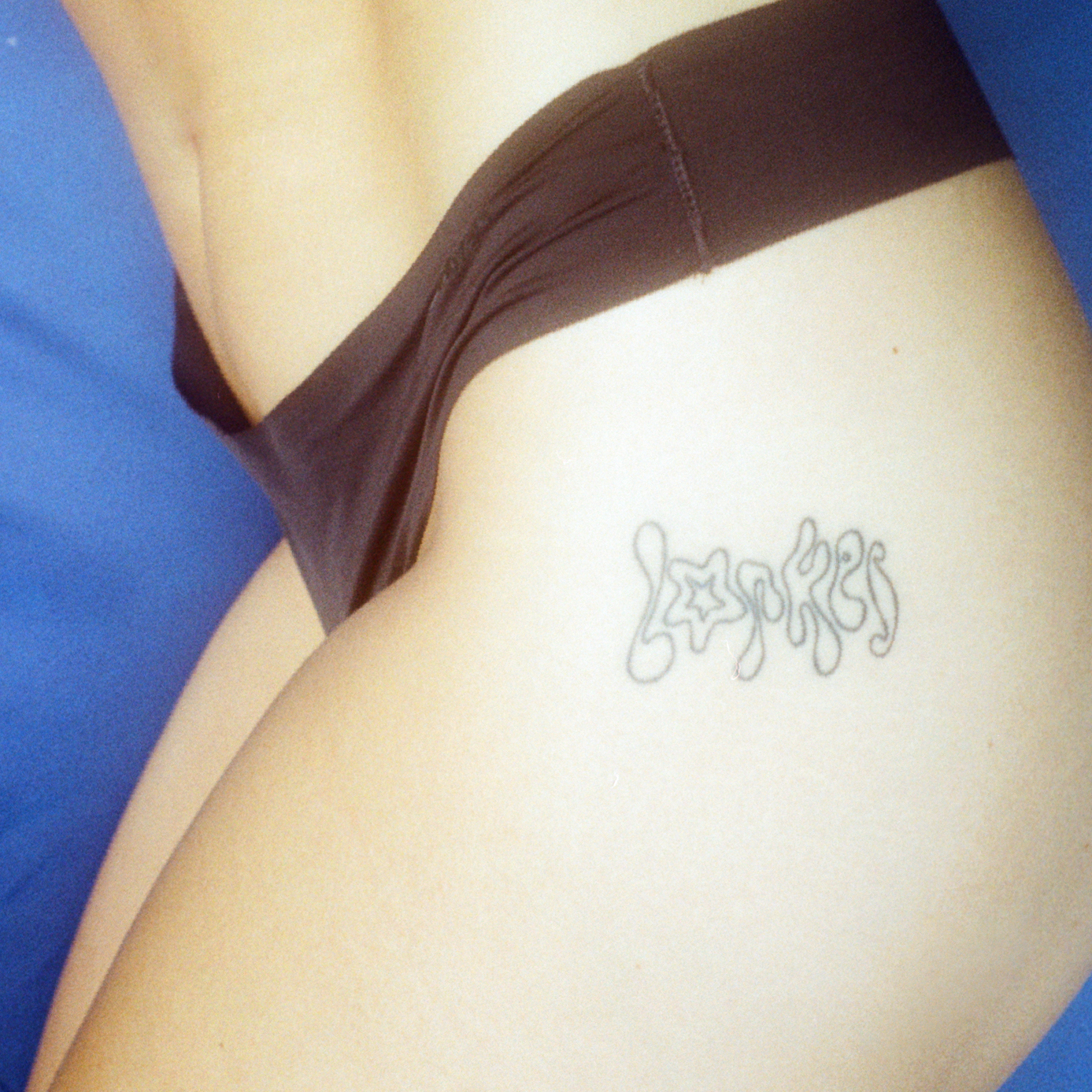
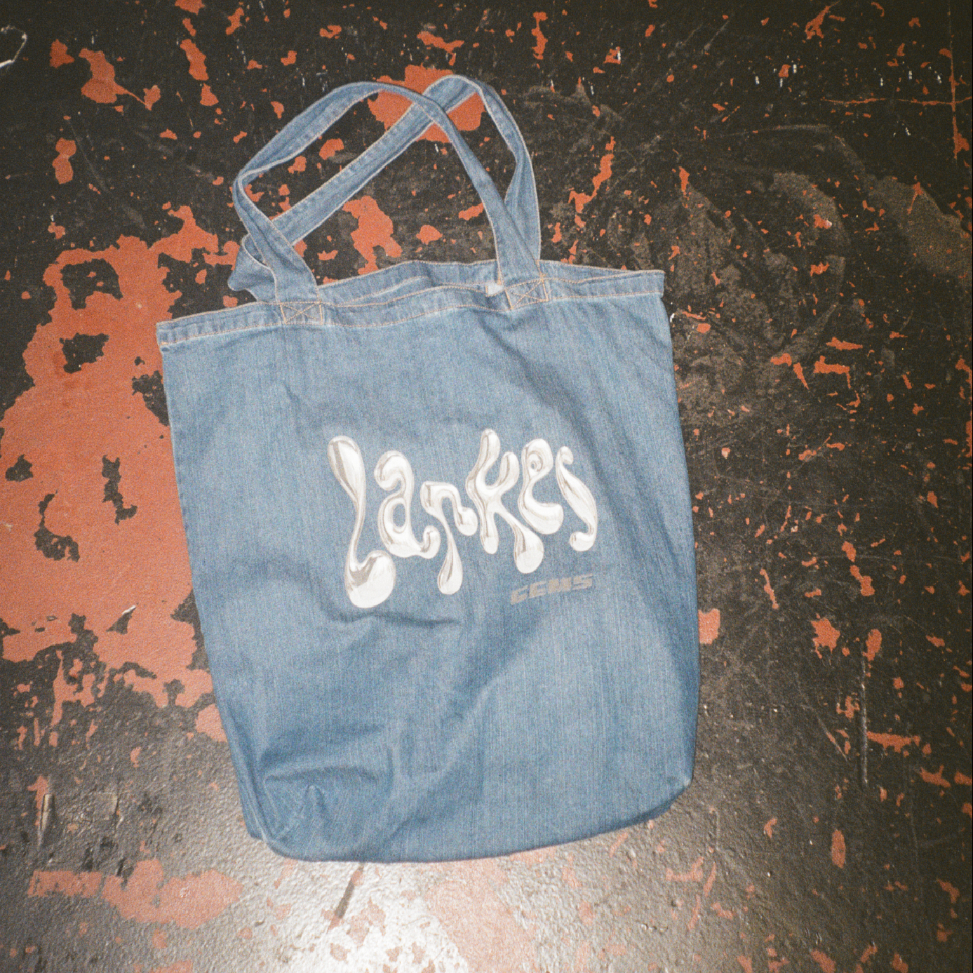
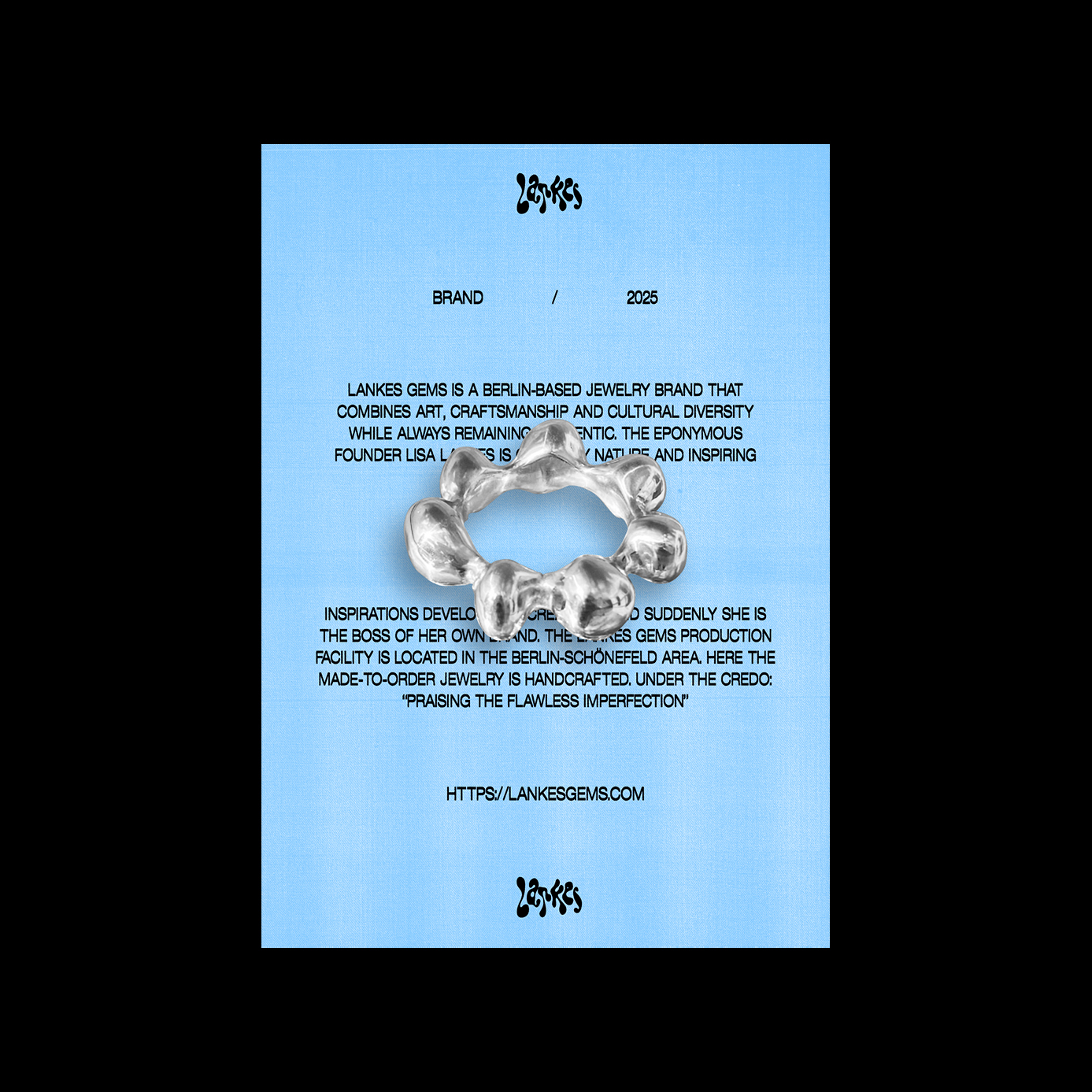
Lankes Gems is a jewelry label shaped by movement, craftsmanship, and a deep connection to nature. Founded by Florian Lankes, the brand brings together influences from Berlin, Lisbon, and Bali, blending cosmopolitan energy with a calm, ocean-inspired sensibility. This balance between freedom and focus formed the conceptual foundation of the visual identity.
The place is the exhibit...
The concept of the place as an exhibit closely aligns with the exhibition concept. The focus is more on the discovery and development of the burial site rather than the mere exhibition. This approach is both a tribute to research and serves as a means of identity formation for the city of Berlin.
The place
is the exhibit...
The concept of the place as an exhibit closely aligns with the exhibition concept. The focus is more on the discovery and development of the burial site rather than the mere exhibition. This approach is both a tribute to research and serves as a means of identity formation for the city of Berlin.
Work:
Client: Lankes Gems by Lisa Lankes
Agency: studio kool
Art Direction: Monique Pfneiszel | Felix Kühl
Work:
Client: Petri Berlin
Copy: -
Art Direction: Felix Kühl
Agency: Zentralnorden
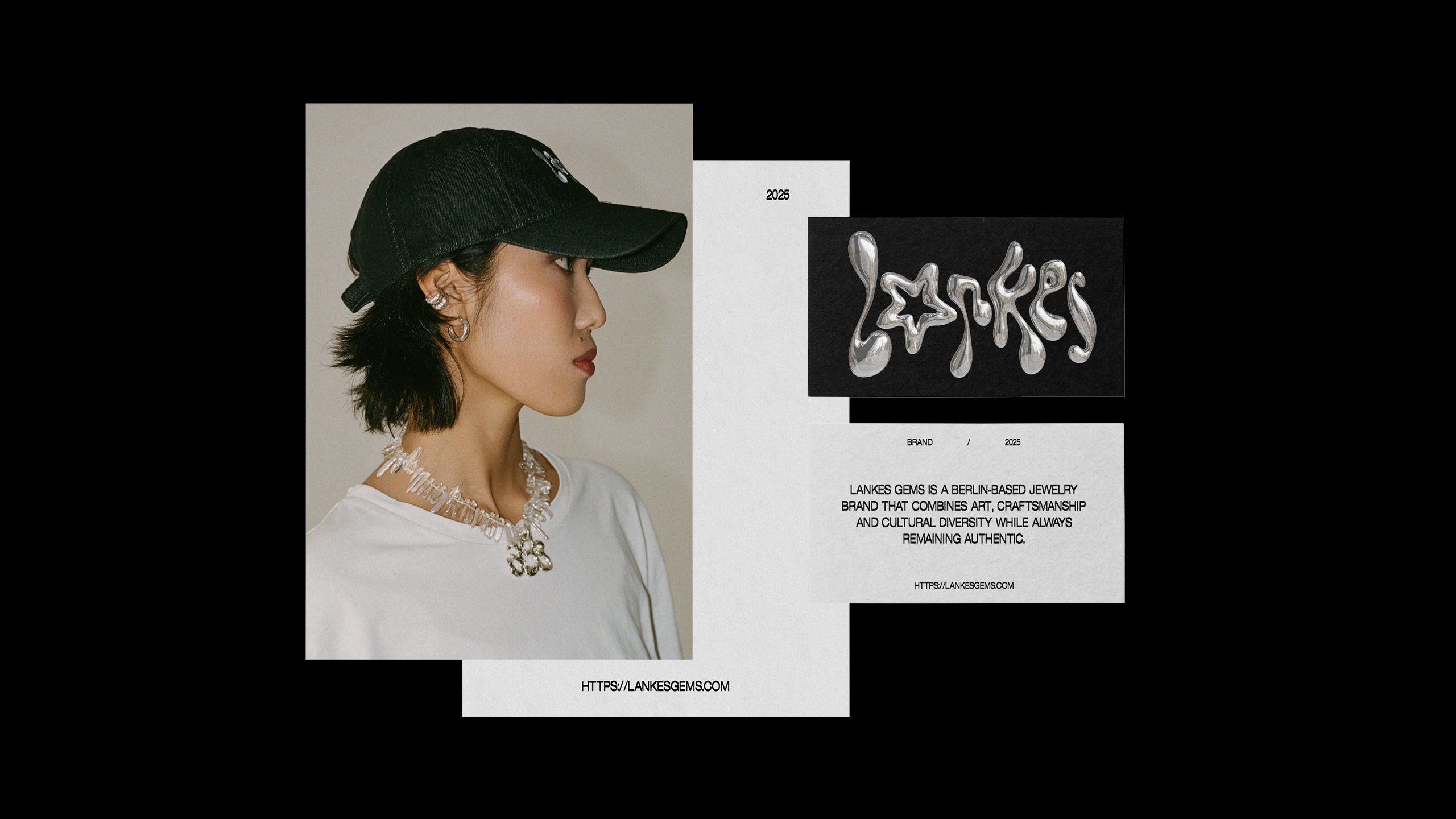
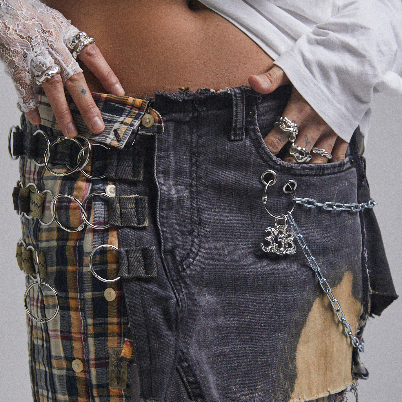
The logo was designed to feel light, fluid, and organic.
Its soft curves reference waves and natural forms, while the restrained
geometry keeps it contemporary and minimal.
Typography and iconography shape both the signage in the physical space and various digital touchpoints.
Typography and iconography shape both the signage in the physical space and various digital touchpoints.
Typography and iconography shape both the signage in the physical space and various digital touchpoints.
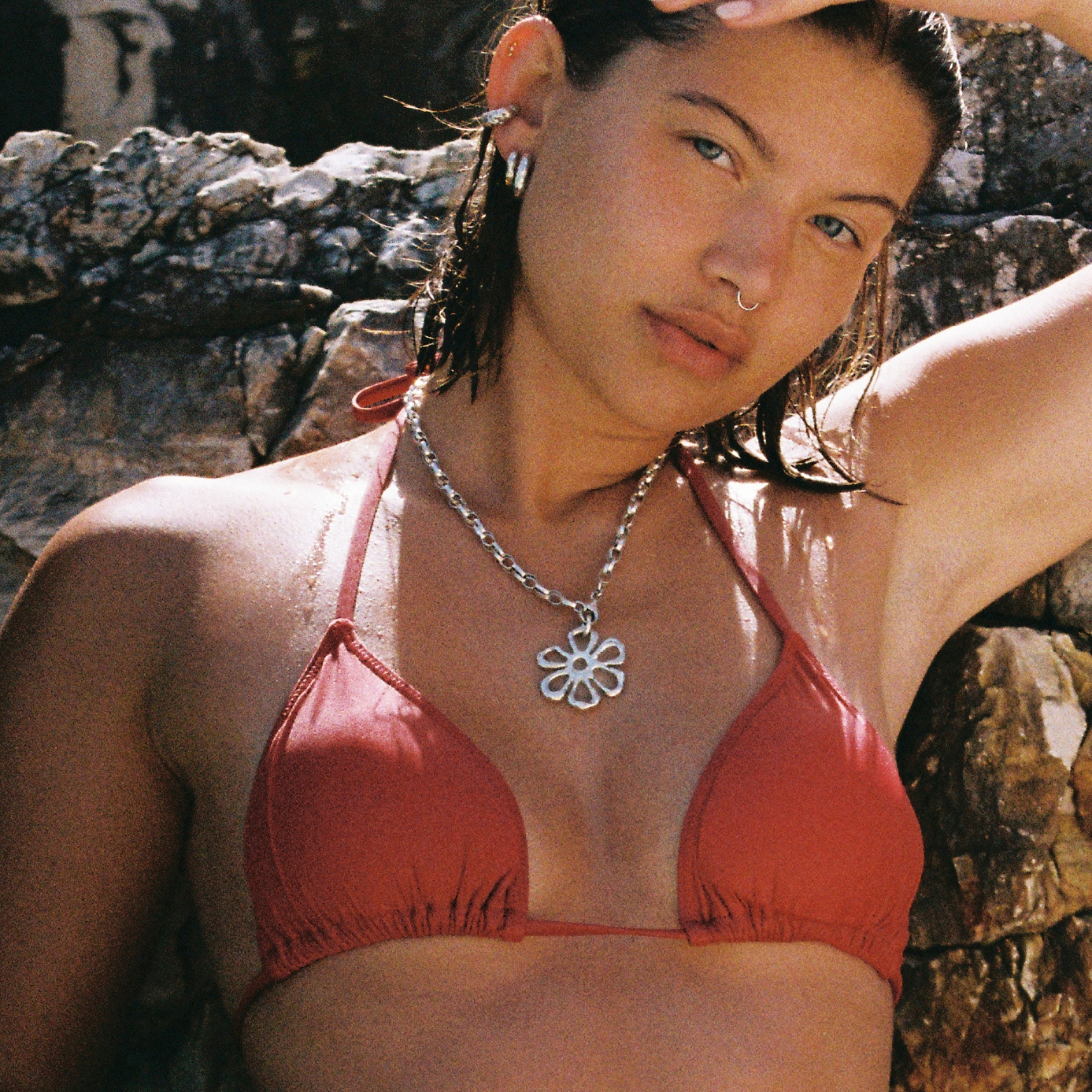
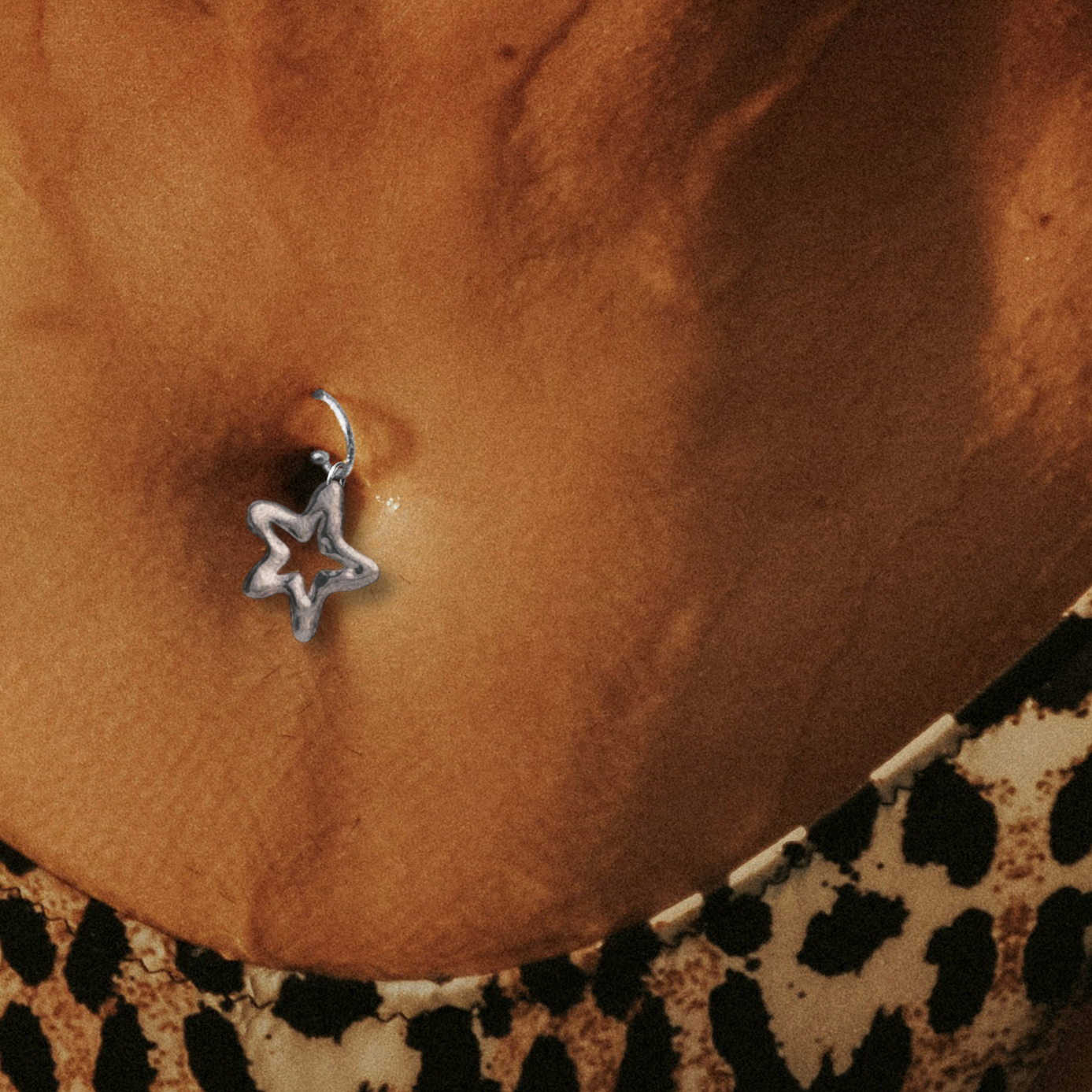
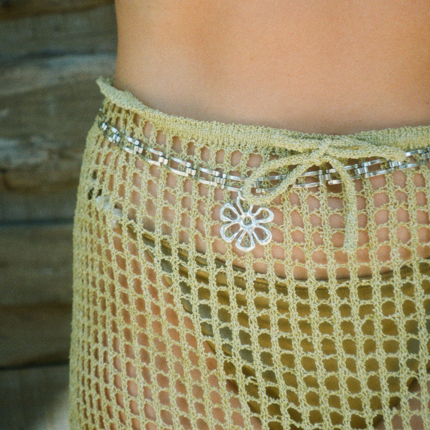
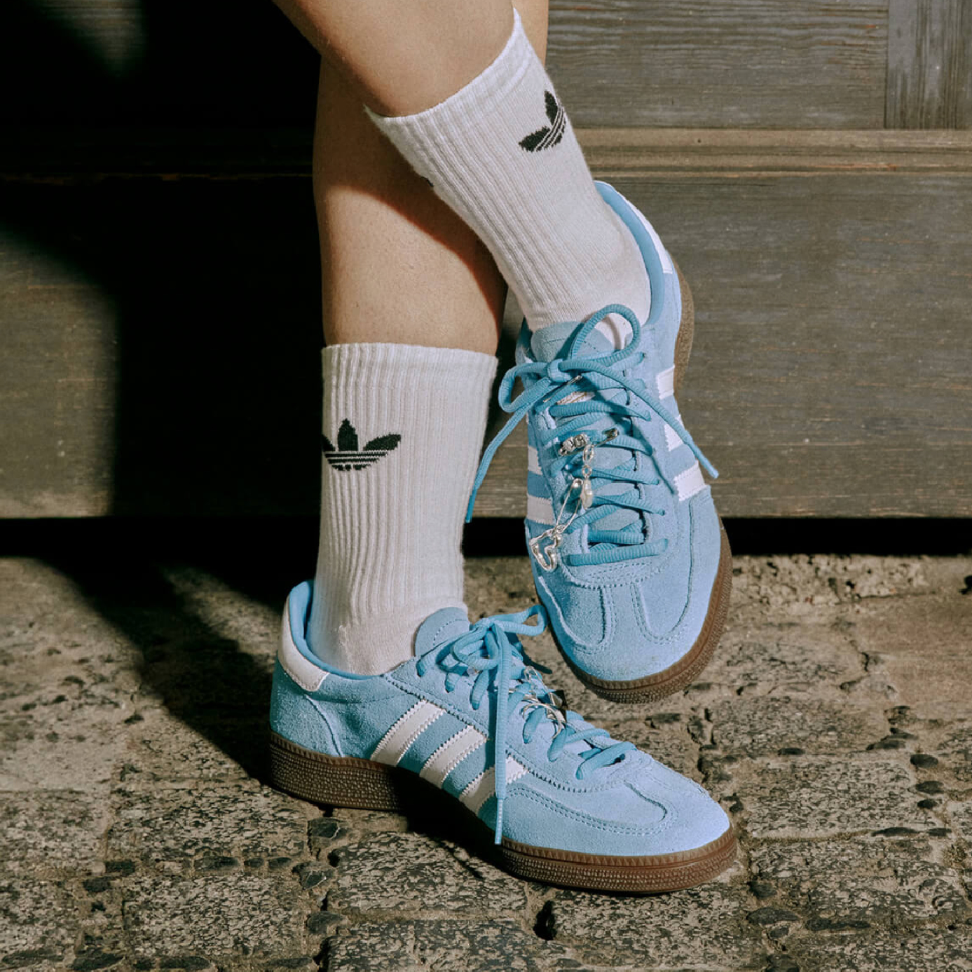
A muted, natural color palette reinforces the brand’s calm and timeless character. Soft neutrals and warm metallic tones echo sand, stone, and silver, allowing the jewelry itself to remain the visual focal point.
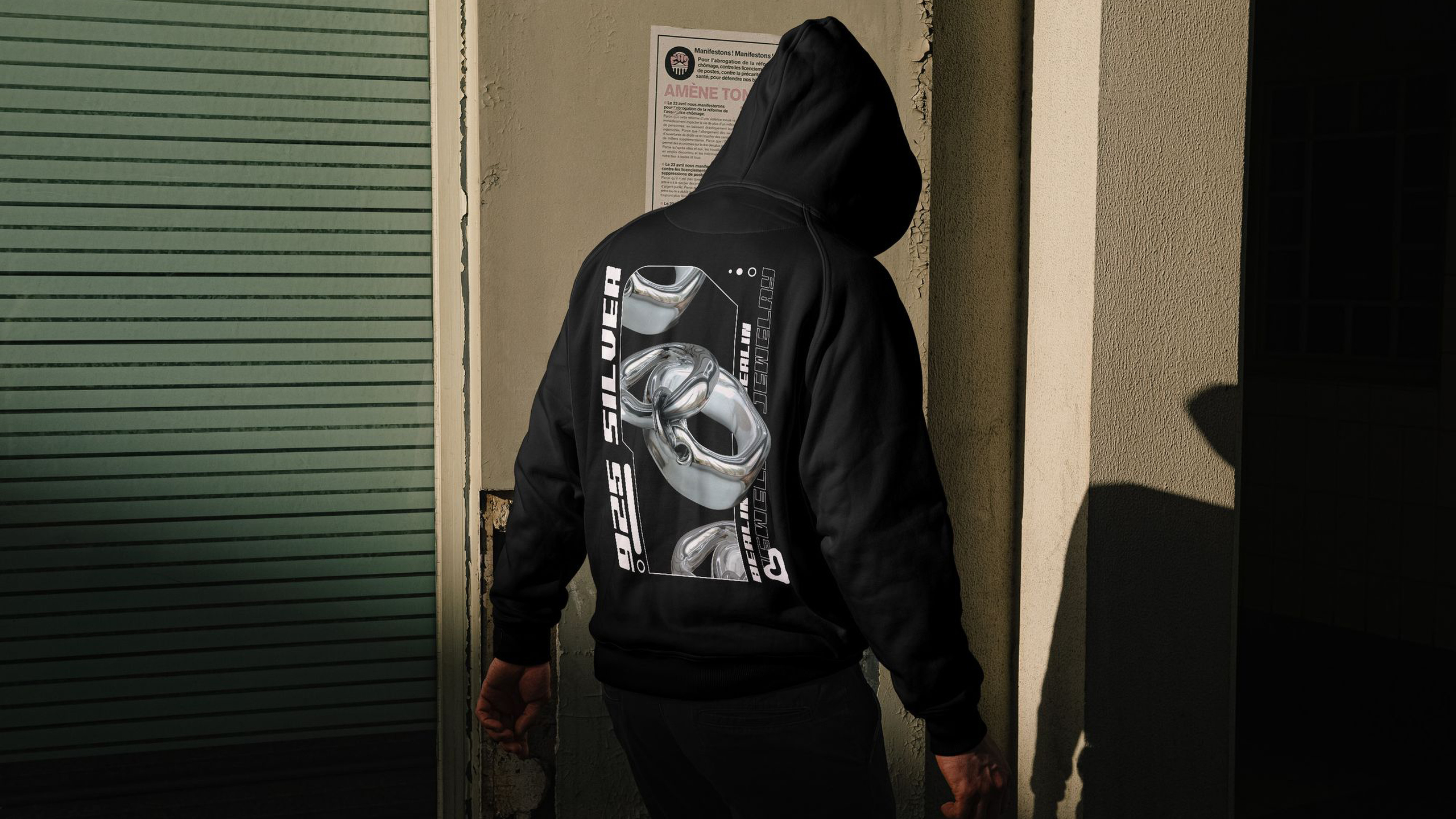
The logo can also be used for employee clothing. For this, we recommend using the secondary colors for optimal contrast.
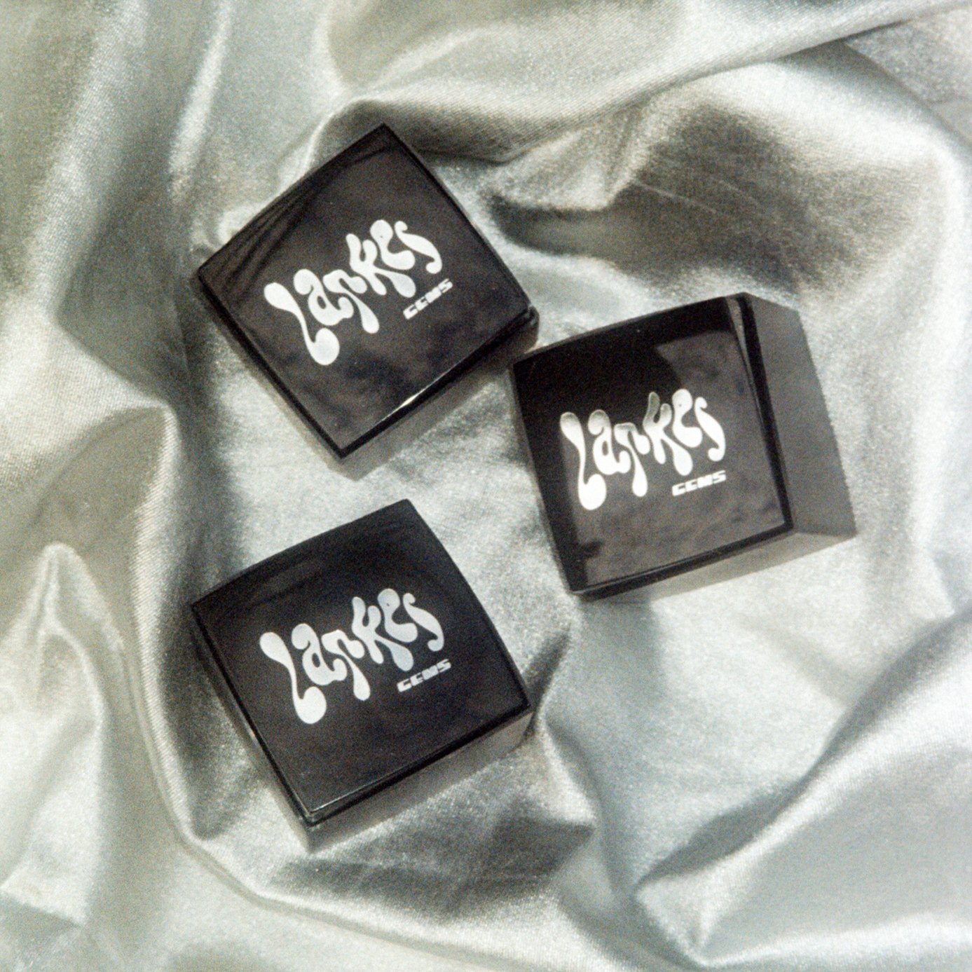

The identity unfolds consistently across packaging, social media, and digital interfaces. Each touchpoint is designed to feel calm, refined, and tactile,
creating a cohesive brand experience.
The logo can also be used for employee clothing. For this, we recommend using the secondary colors for optimal contrast.

Want to create
something?
Want to create
something?