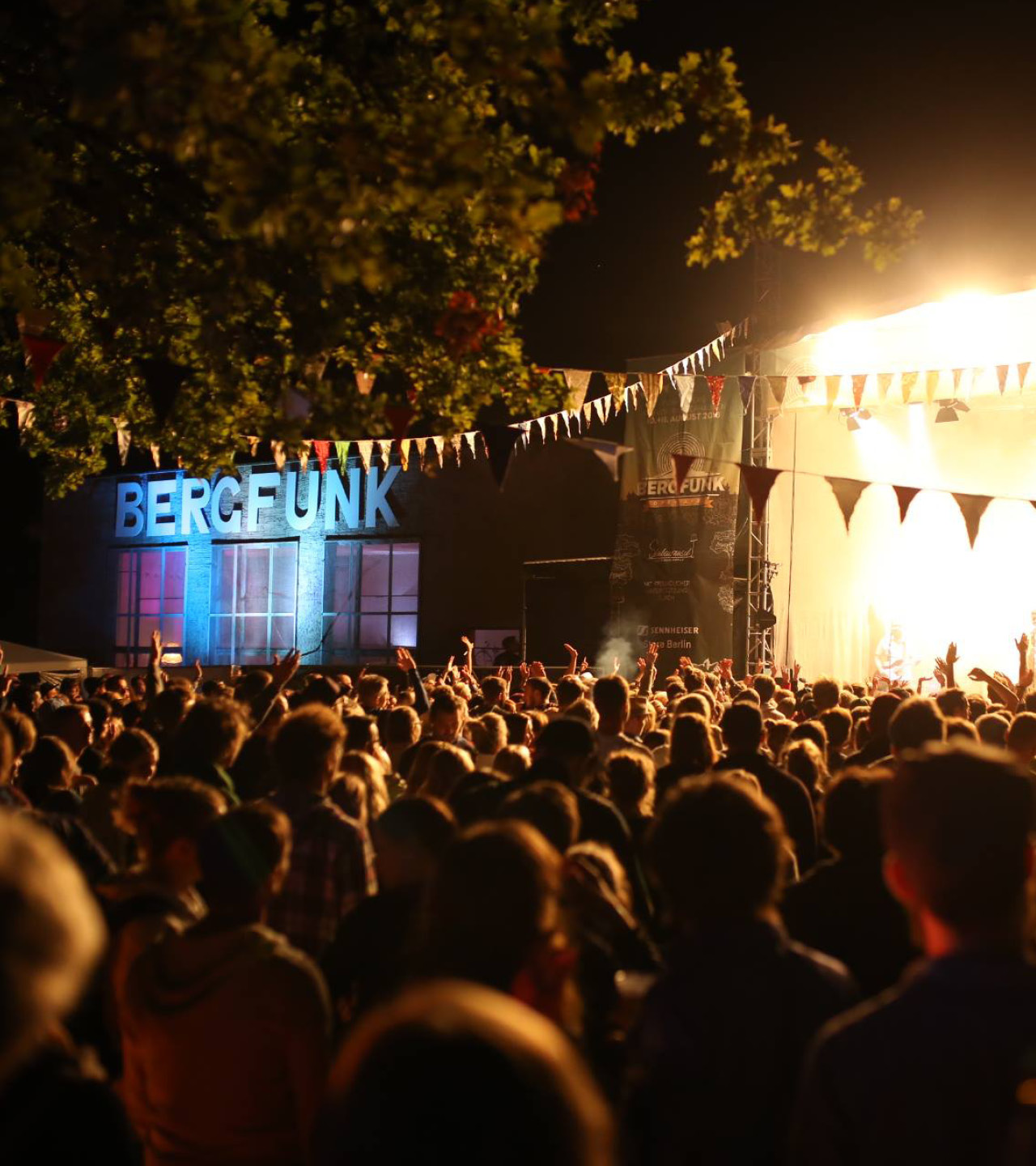
The Bergfunk Openair
The Bergfunk event is a lively blend of broadcasting houses, top-notch music, and an array of handmade goods. It embodies not just a matter of the heart but much more.
The challenge of repositioning this wonderful event led me to the idea that the rebranding should precisely reflect these values.
The Bergfunk Openair,
Dancing between broadcasting houses, the best music and a bunch of handmade goods. Thats what describes the Bergunk best - A matter of the heart and much more.
I was asked to rebrand this beautiful event and thought the approach should exactly show those values.
Work:
Client: Bergfunk
Art Direction: Felix Kühl
Design: Felix Kühl
Just a small festival outside of Berlin, build from a small group of people who want to give something back to their home. I thought the approach should be clean, simple and fun.
Just a small festival outside of Berlin, build from a small group of people who want to give something back to their home. We thought the approach should be clean, simple and fun.
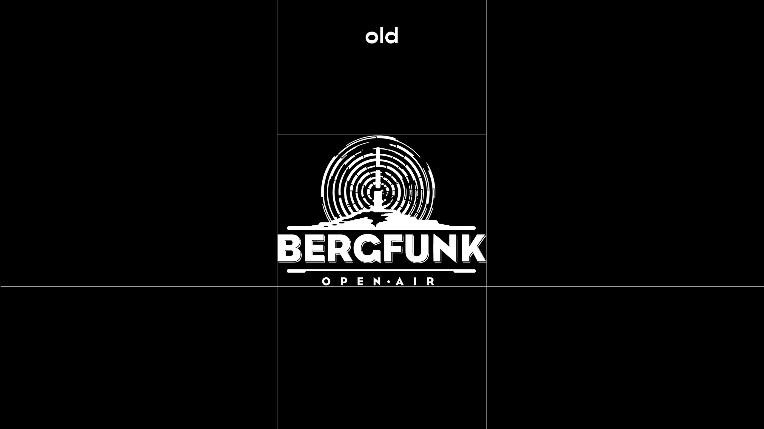
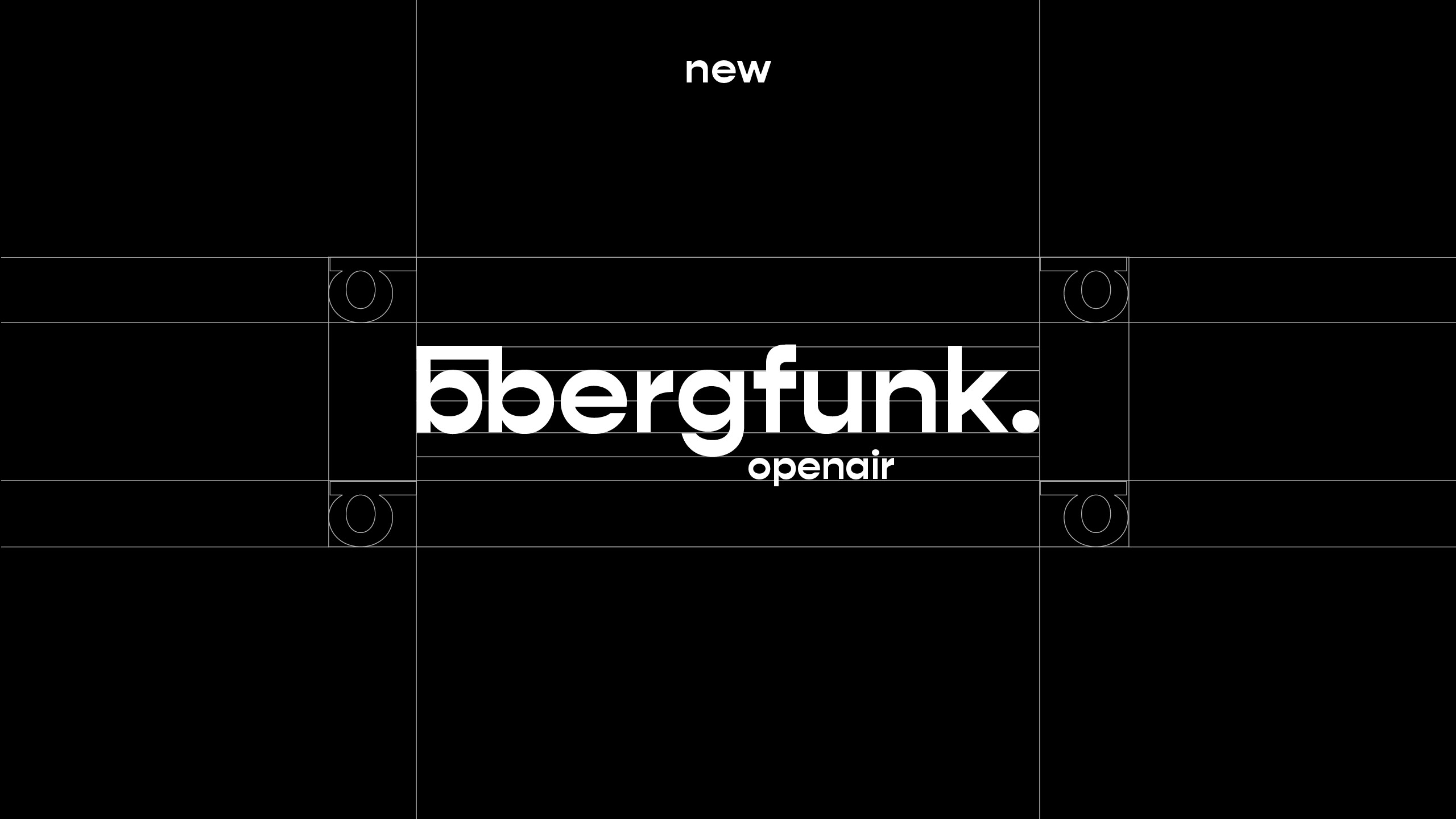
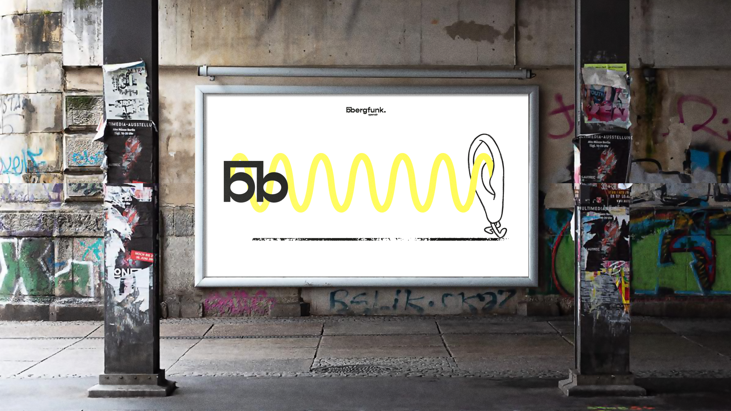
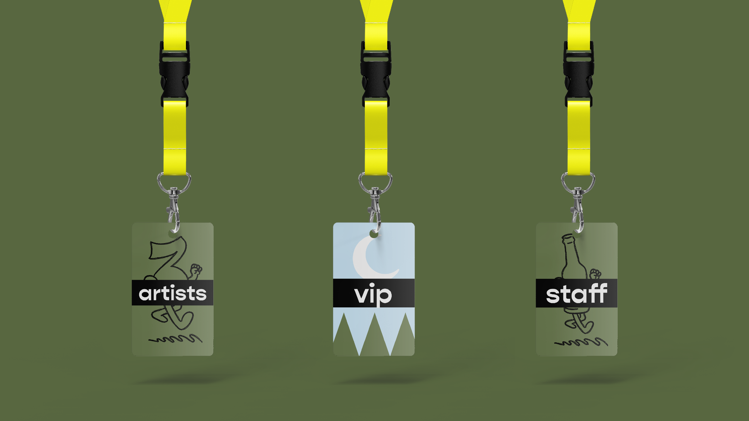
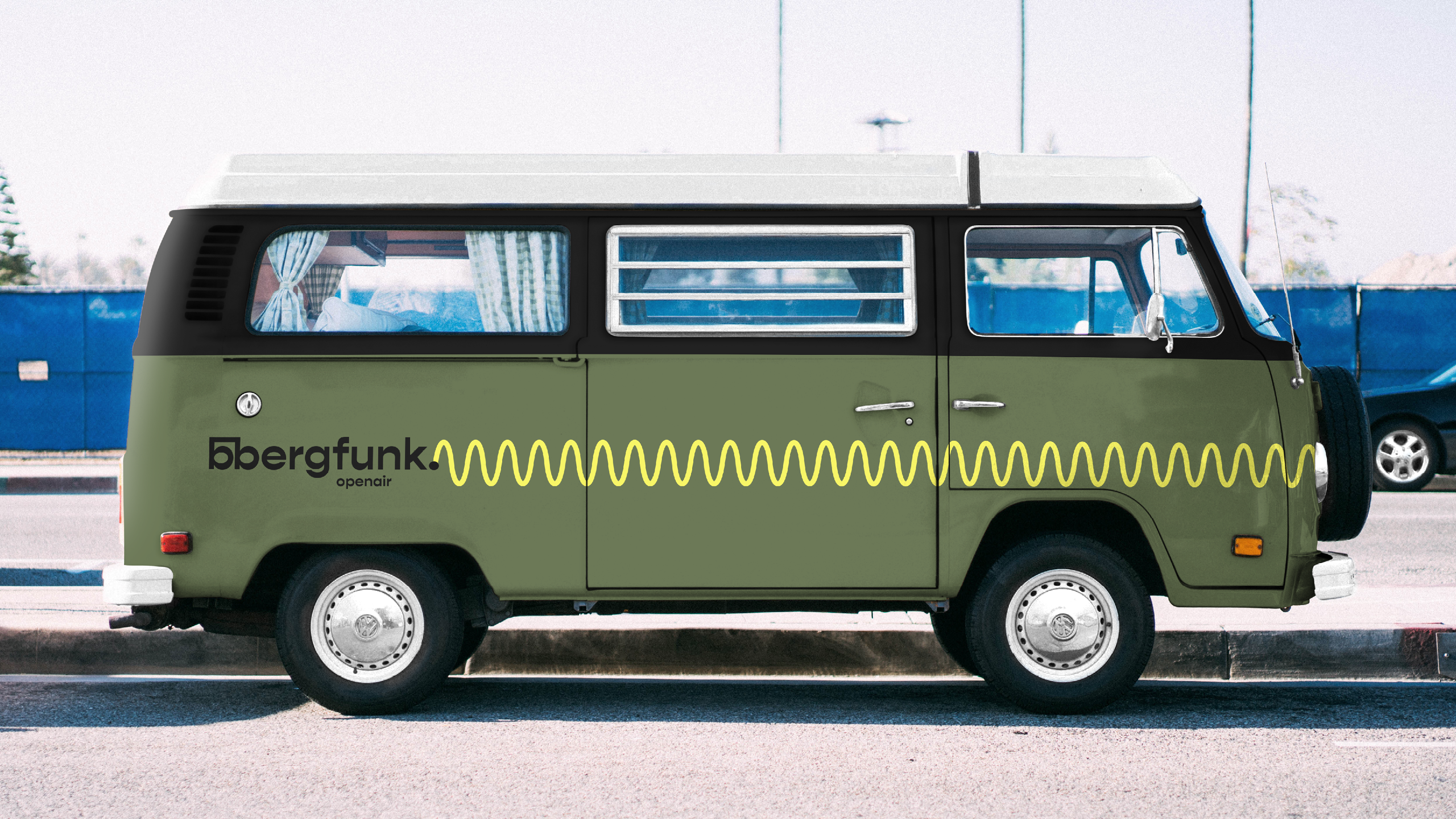
Logo
Bouncy just like the vibe
Hey there, this is the default text for a new paragraph. Feel free to edit this paragraph by clicking on the yellow edit icon.
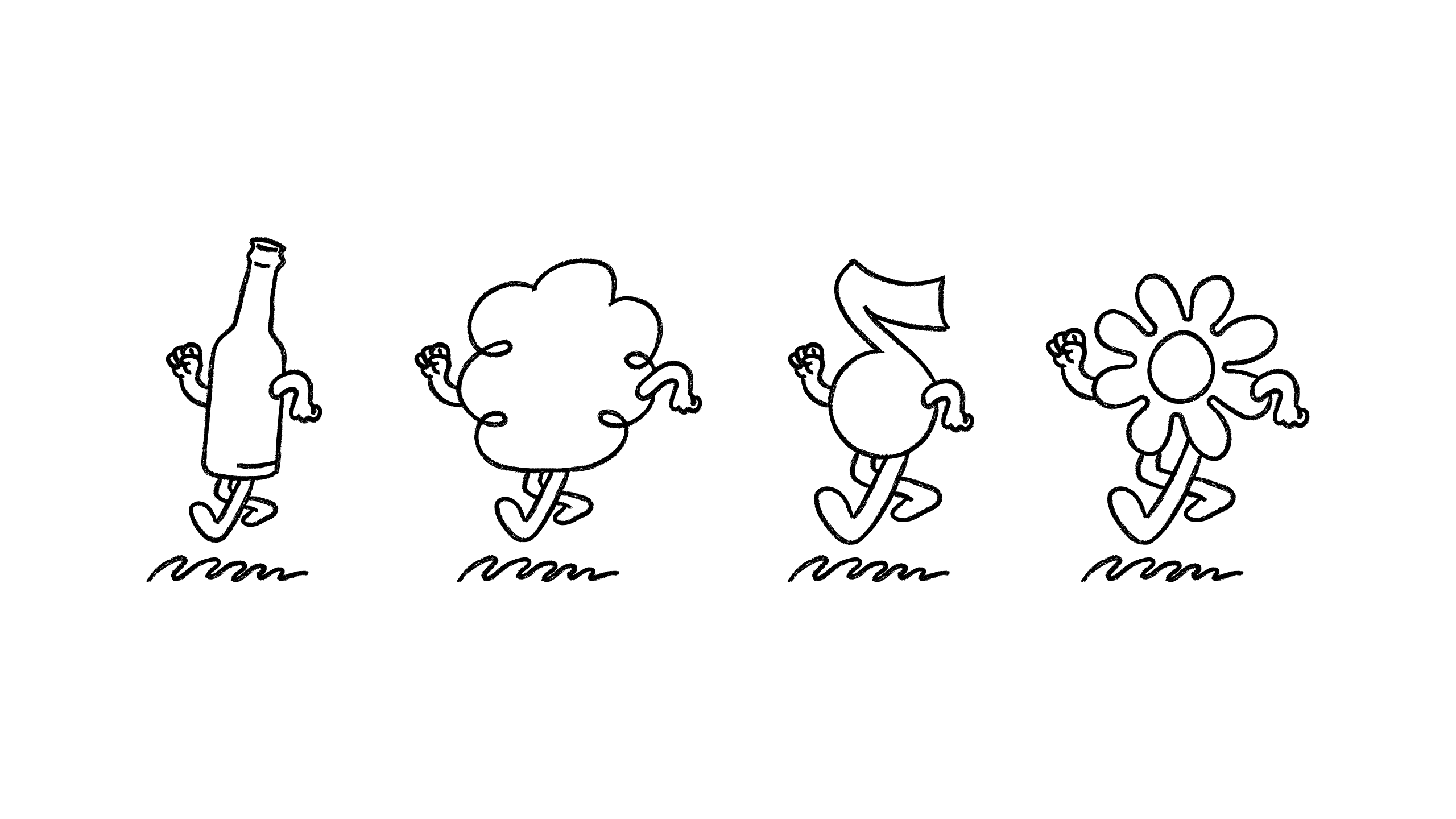
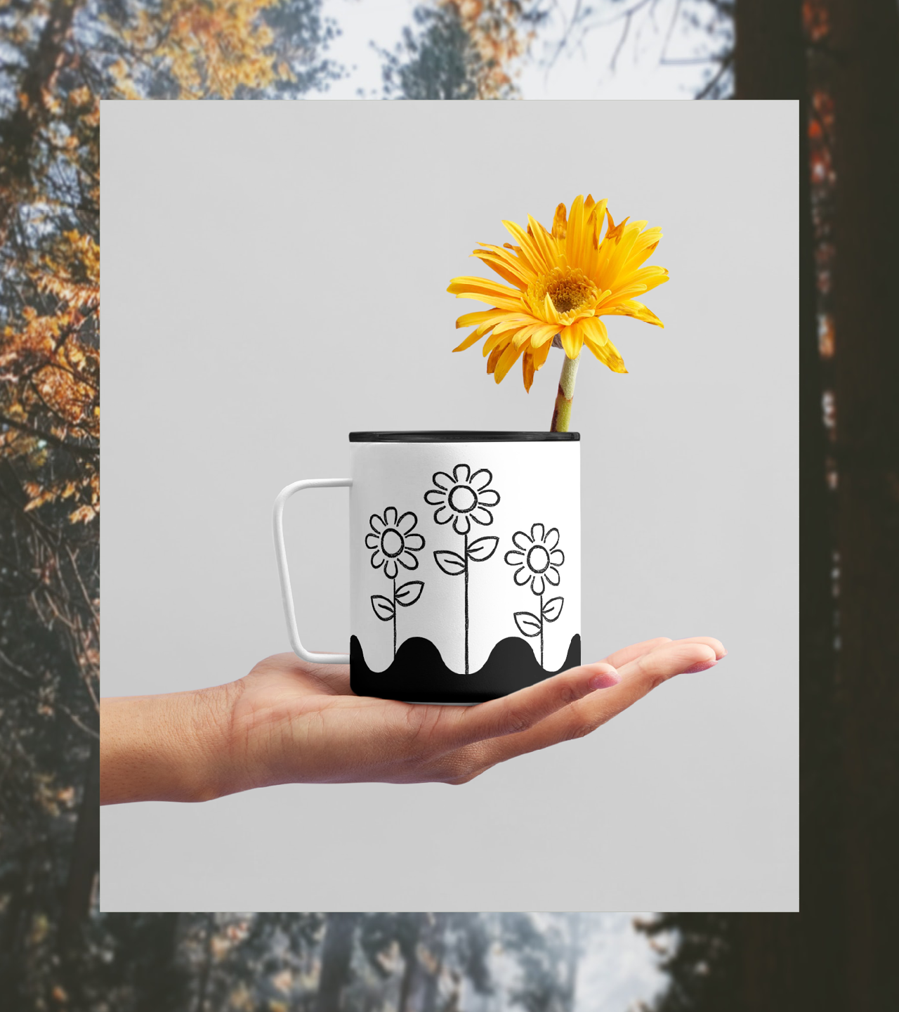
Handcraffted vibes needed to be supported by
illustrations that hit the very same mark.
Handcraffted vibes needed to be supported by
illustrations that hit the very same mark.
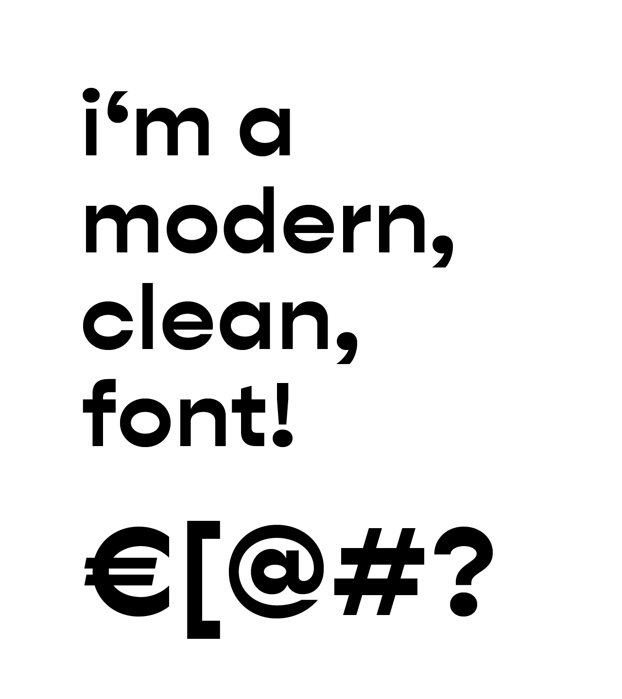
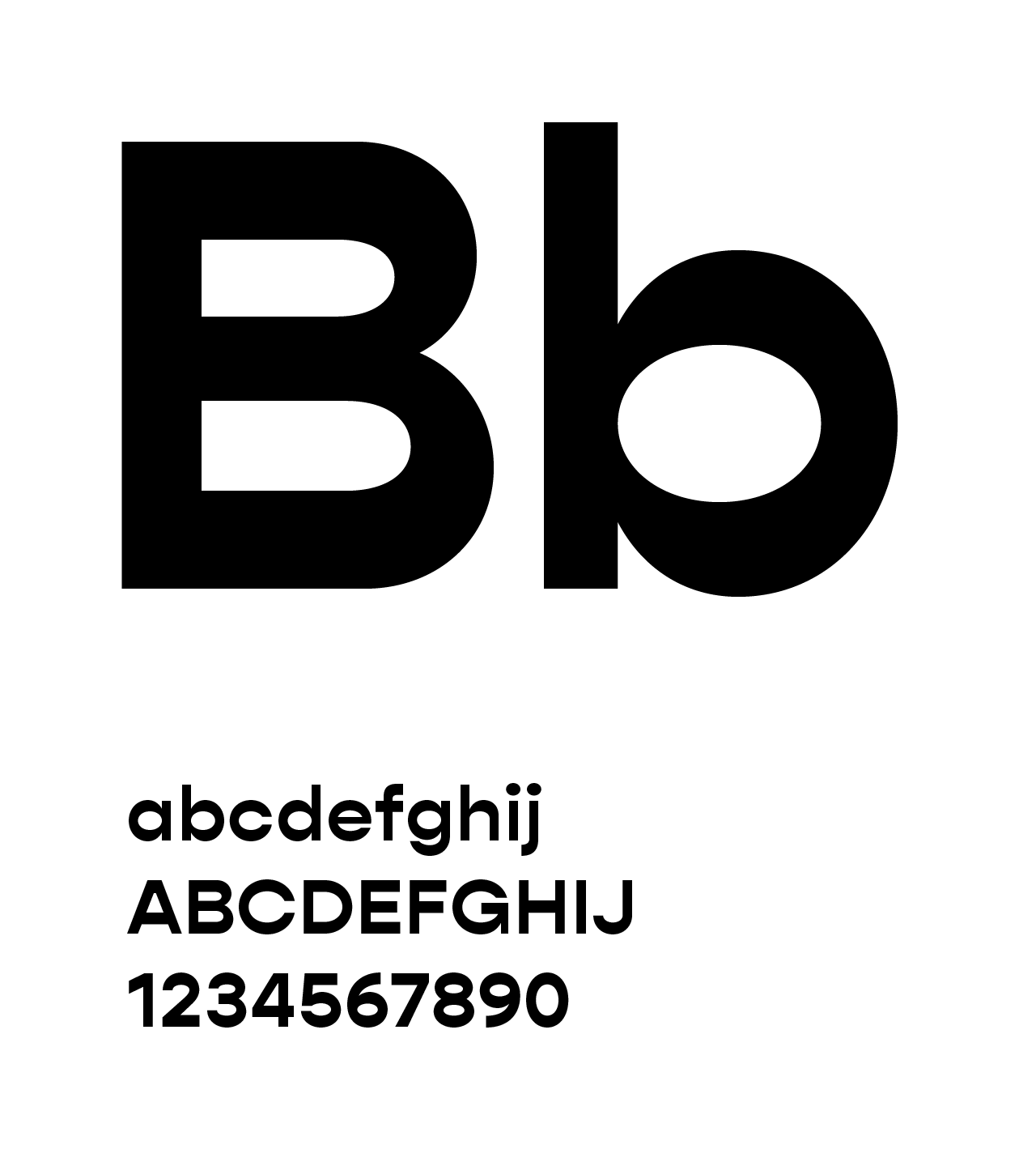
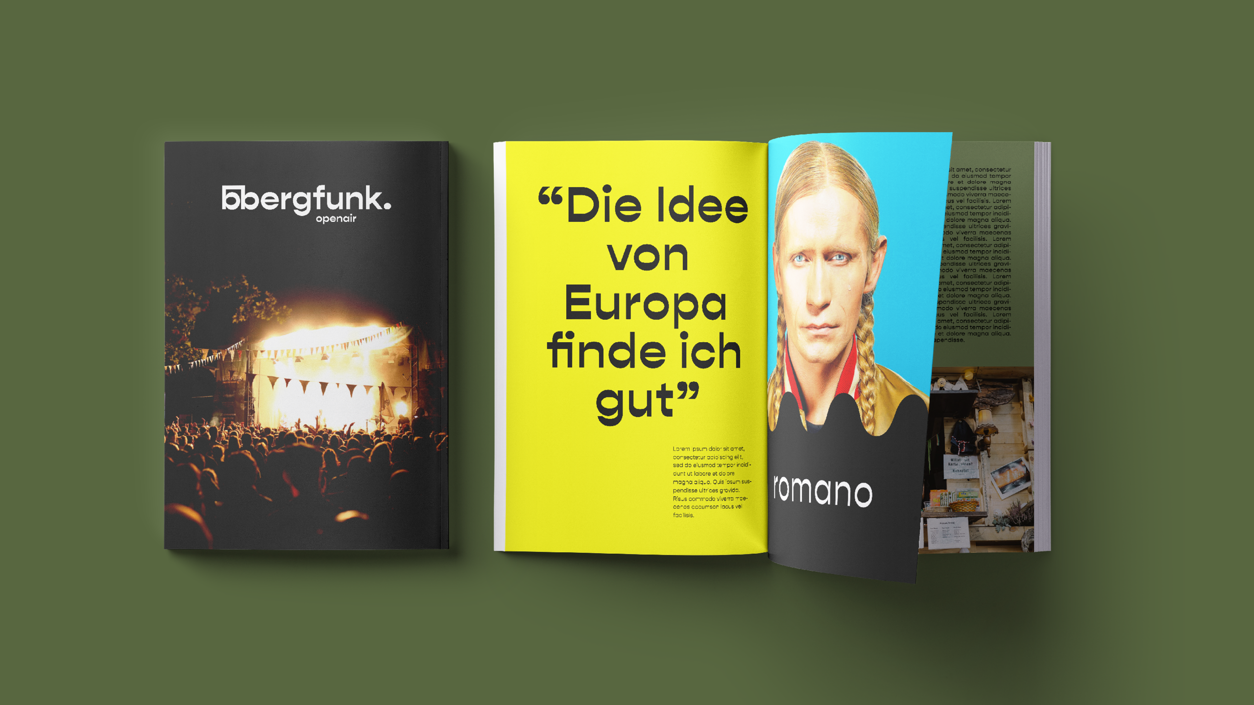
Typography
Geometric Simplicity with a retro touch.
Geometric Simplicity with a retro touch.
The Typography is a geometric, sans-serif font with reverse contrast. A typical contrast features thicker vertical strokes and thinner horizontal ones, but this font offers a unique appearance by reversing this contrast.
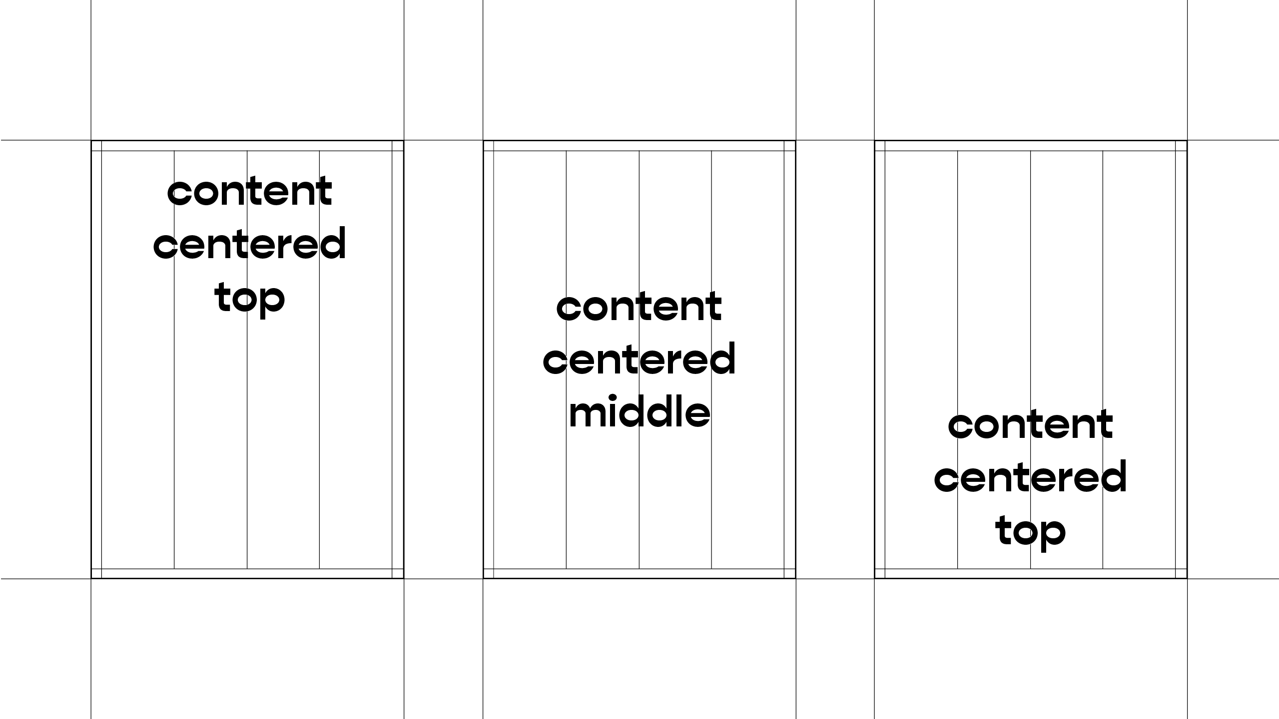
This simpel and geometric approach is also followed in the Layout and image compositions.
The Typography is a geometric, sans-serif font with reverse contrast. A typical contrast features thicker vertical strokes and thinner horizontal ones, but this font offers a unique appearance by reversing this contrast.
This simpel and geometric approach is also followed in the Layout and image compositions.
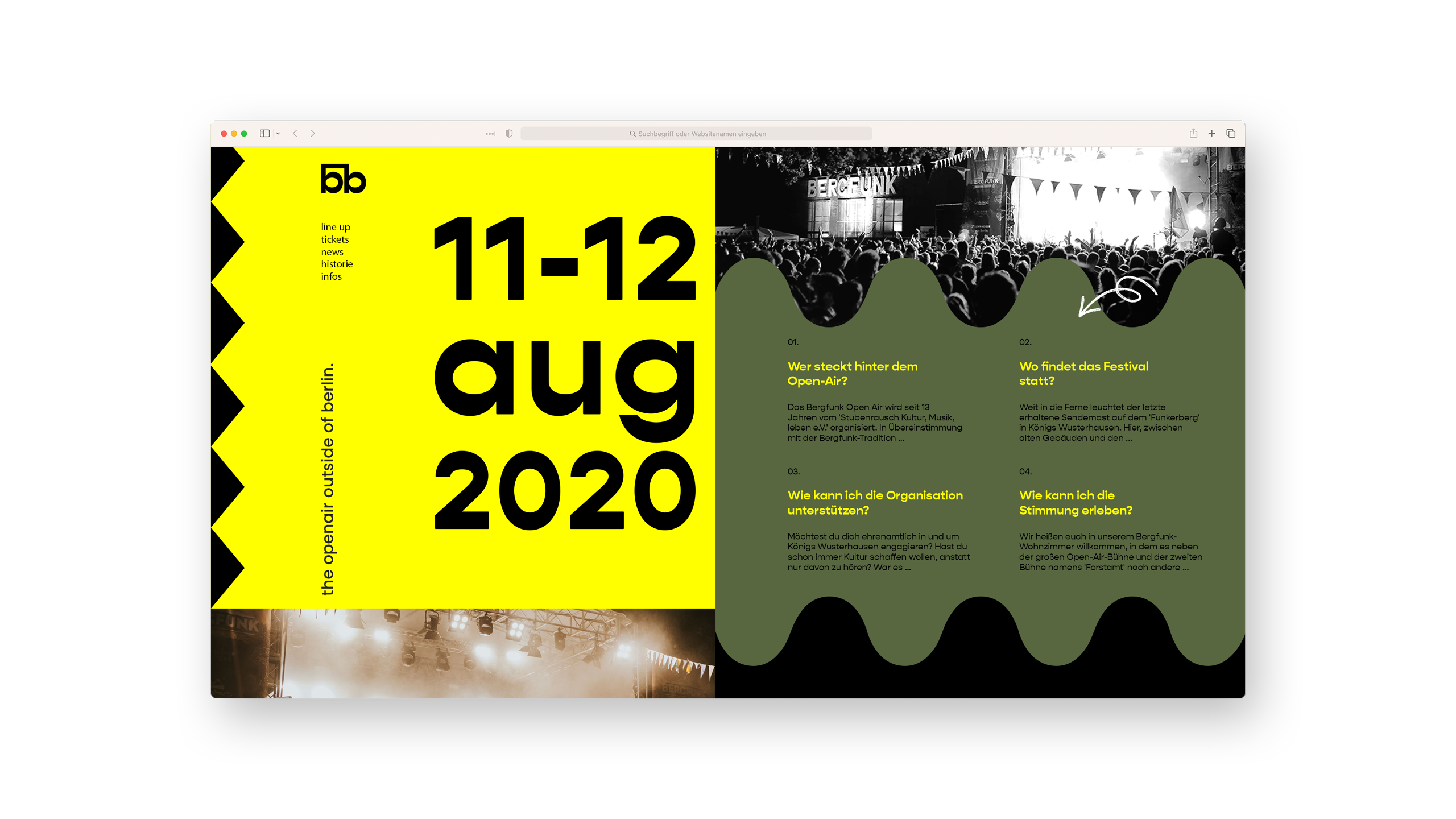
Digital
Digital
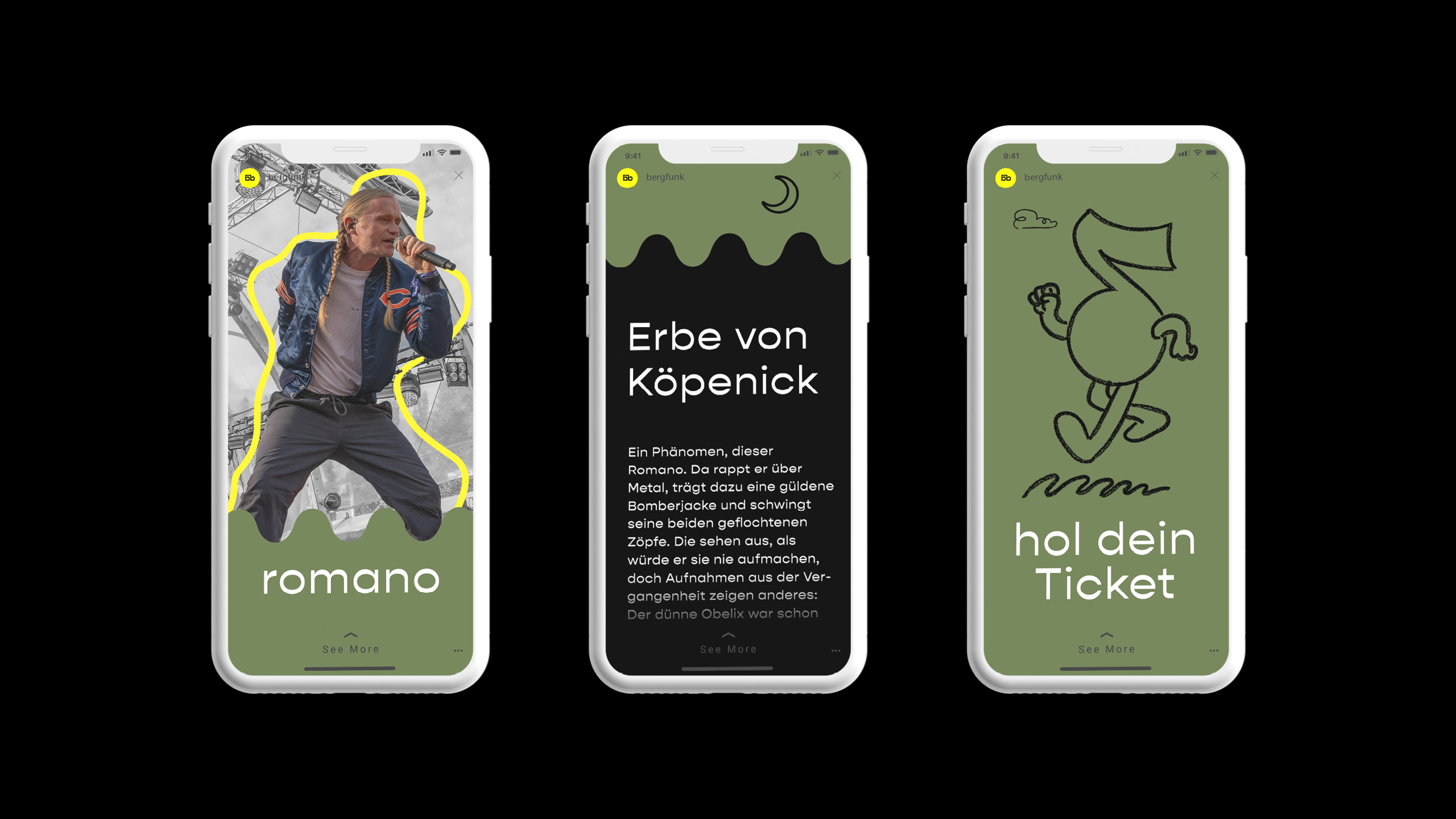
Crafting Vibrant Visuals
Crafting Vibrant Visuals
Besides finding a vibrant Branding which would work for the festival itself it was important to create a visual language which is easy to adapt in a digital environment.
The Balance between handrawn shapes/illustrations and the geometric embody the handcrafted vibe in every aspect of the visual language.
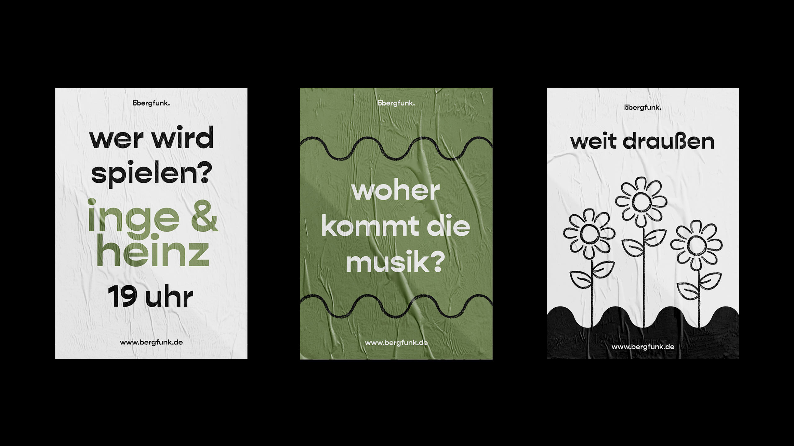
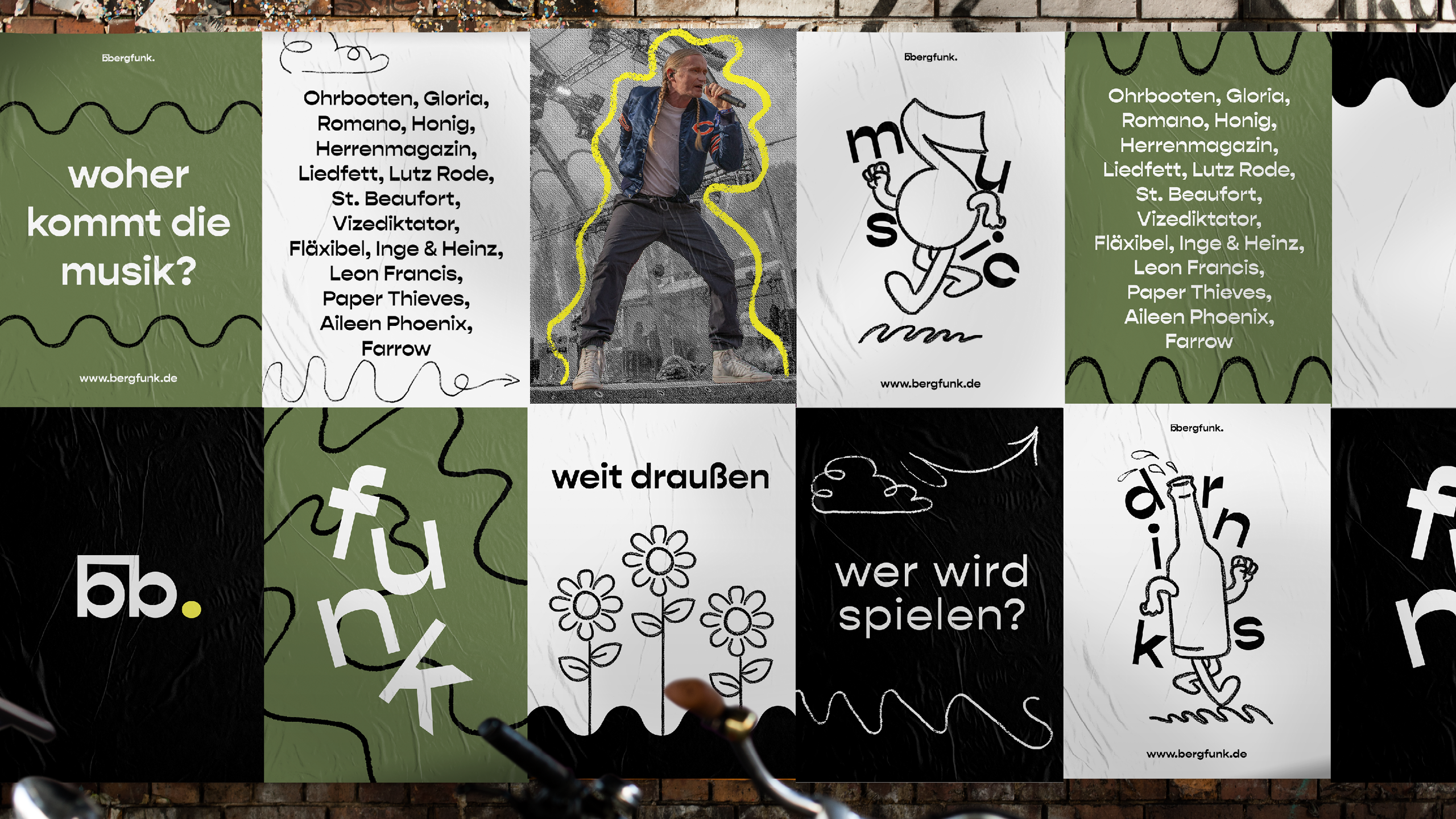
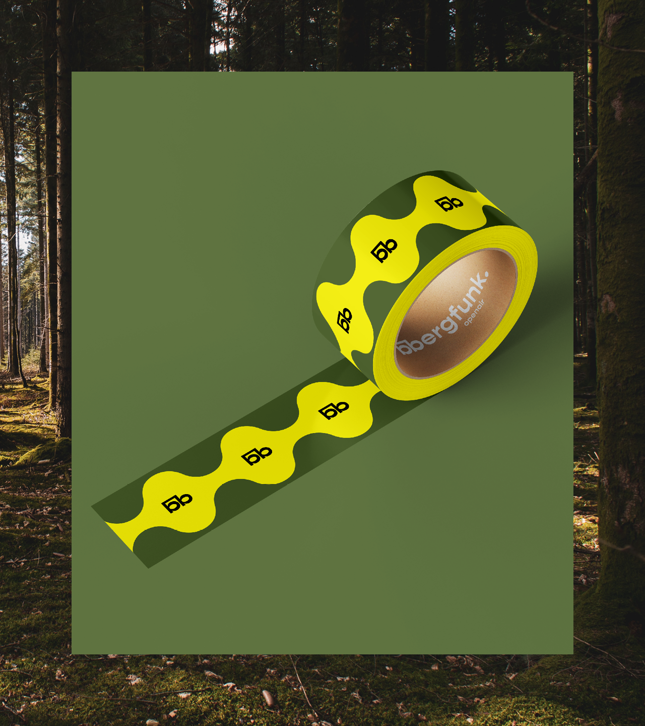
Publicity Materials
Nature-Inspired, Infused with Festive Vibrance.
Nature-Inspired, Infused with Festive Vibrance.
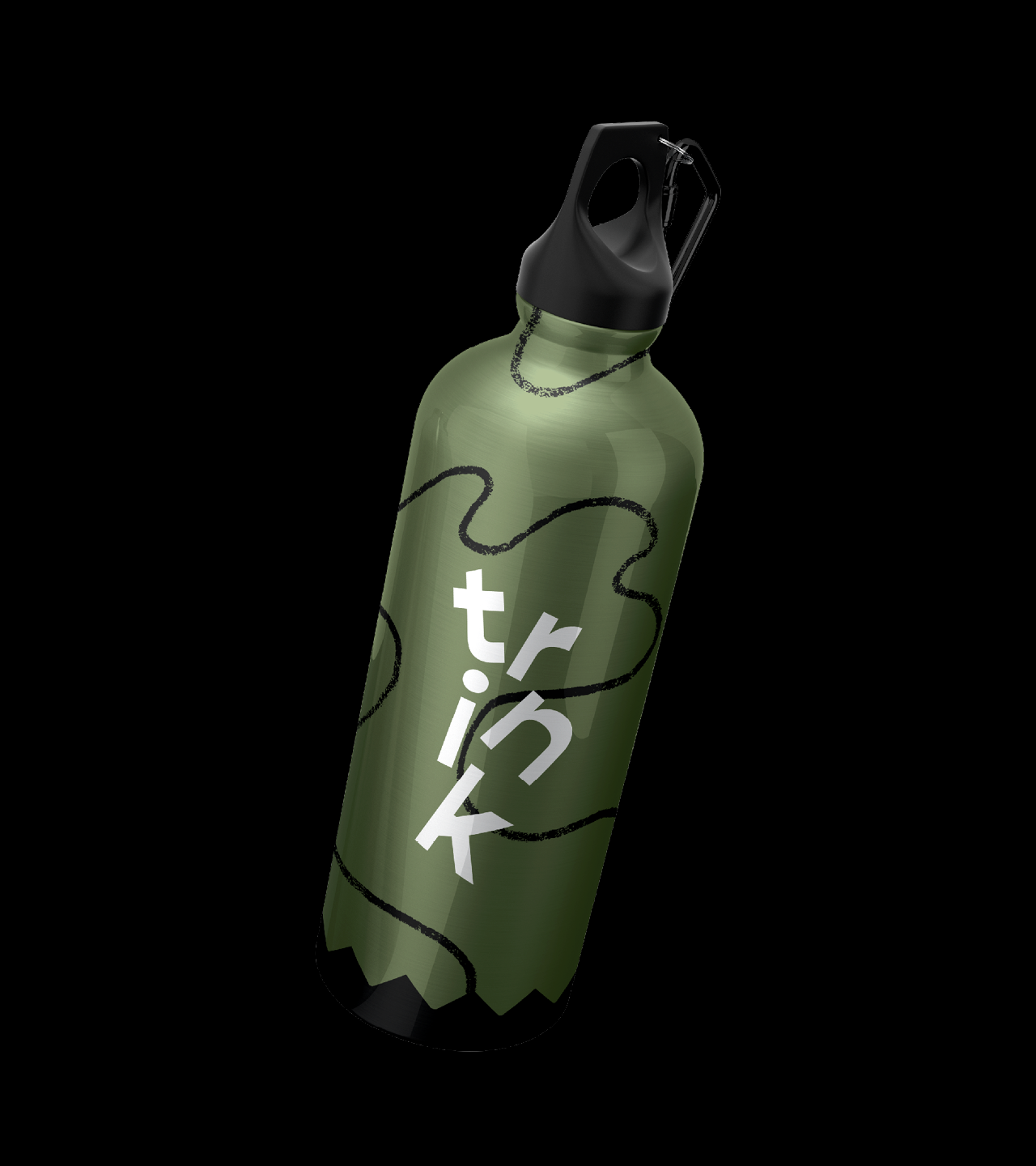
The identity system provides a limited range of nature-inspired color combinations. The harmony in the color scheme is interrupted by the bright yellow, inspired by the festival's location - an old broadcasting house. This theme adds a vibrant festive quality to merchandise, promotions, and publicity materials.
The identity system provides a limited range of nature-inspired color combinations. The harmony in the color scheme is interrupted by the bright yellow, inspired by the festival's location - an old broadcasting house. This theme adds a vibrant festive quality to merchandise, promotions, and publicity materials.
Want to create
something?
Want to create
something?