Revamping the Image...
During my time at BBDO, I was mainly responsible for the day-to-day operations of a sex toy company. During this period, I was also tasked with developing a rebranding concept for this brand. Strategically, we aimed to focus on a sophisticated appearance that also conveyed a bold attitude. As sex toys are still predominantly purchased online, the new branding was intended to support the digital approach.
Work
Client: Womanizer
Copy: Charlotte Gärtner
Art Direction: Felix Kühl
Design: Felix Kühl
Agency: BBDO Germany
Work
Client: Womanizer
Copy: Charlotte Gärtner
Art Direction: Felix Kühl
Design: Felix Kühl
Agency: BBDO Germany
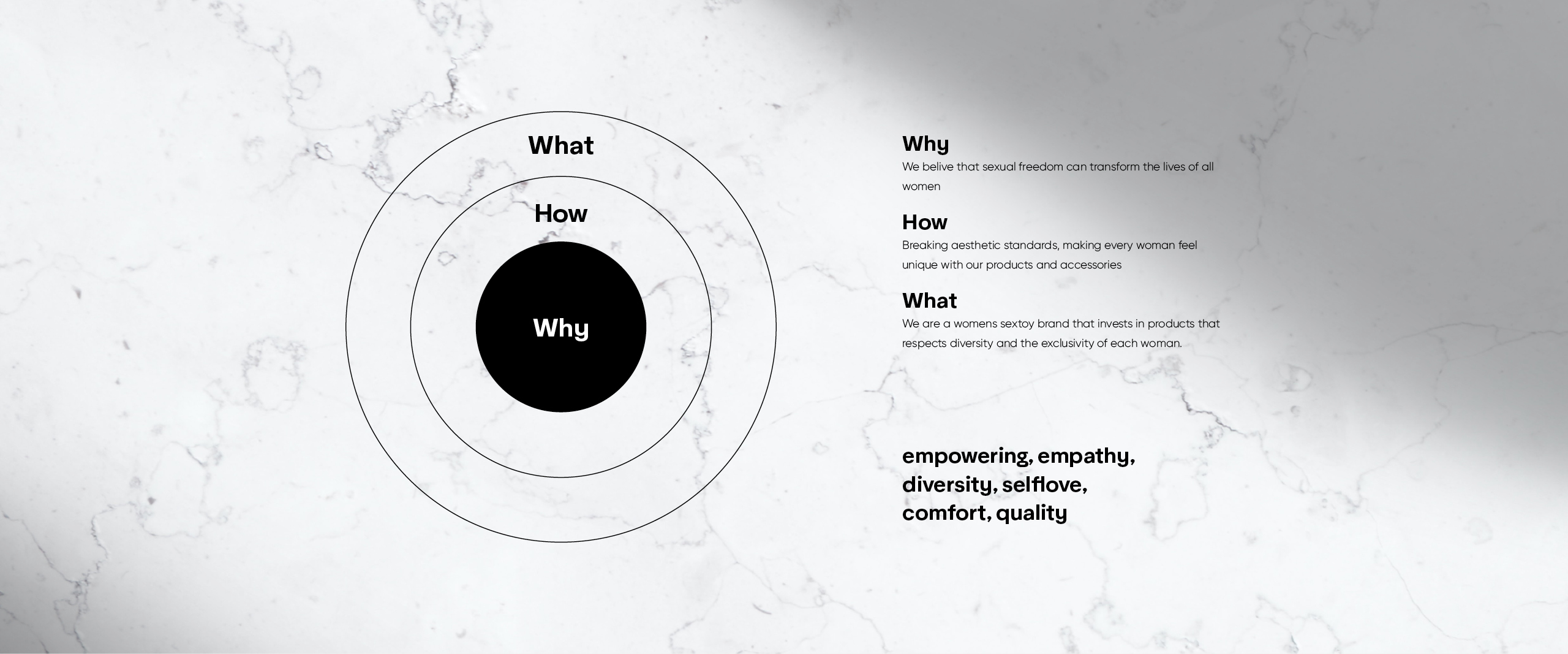
Concept
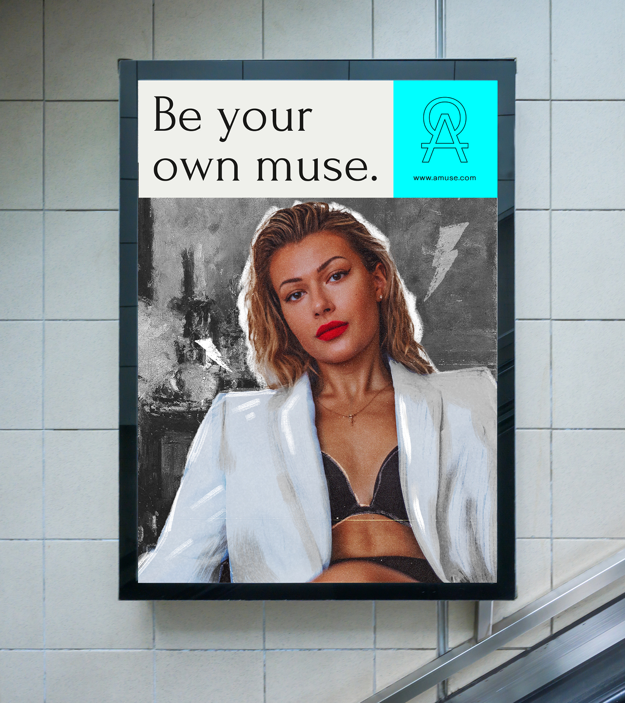
Breaking Boundaries
Breaking Boundaries
We choose to focus on a field that is not typically the first thing that comes to mind when you think about sex toys, yet it is underrepresented in the current mainstream: art.
We choose to focus on a field that is not typically the first thing that comes to mind when you think about sex toys, yet it is underrepresented in the current mainstream: art.

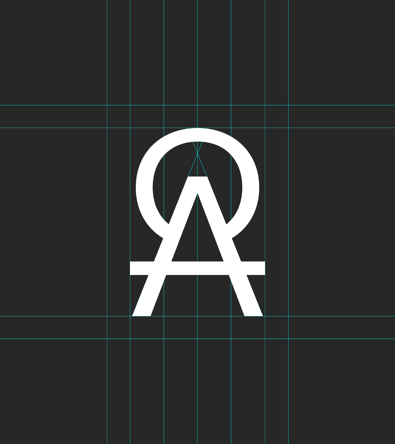
Logo
Concept
Concept
Hey there, this is the default text for a new paragraph. Feel free to edit this paragraph by clicking on the yellow edit icon. After you are done just click on the yellow checkmark button on the top right. Have Fun!
Hey there, this is the default text for a new paragraph. Feel free to edit this paragraph by clicking on the yellow edit icon. After you are done just click on the yellow checkmark button on the top right. Have Fun!
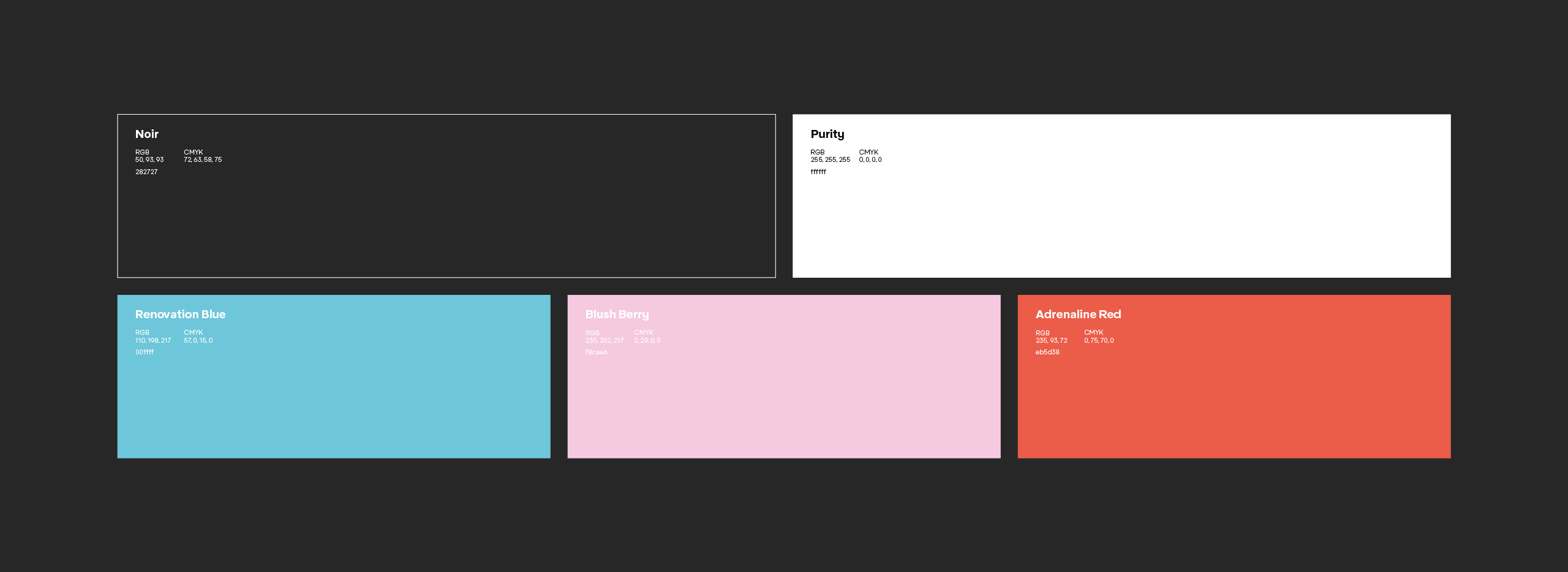
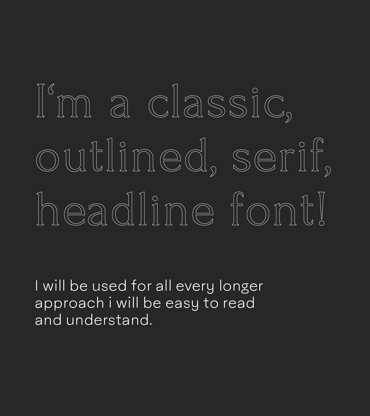
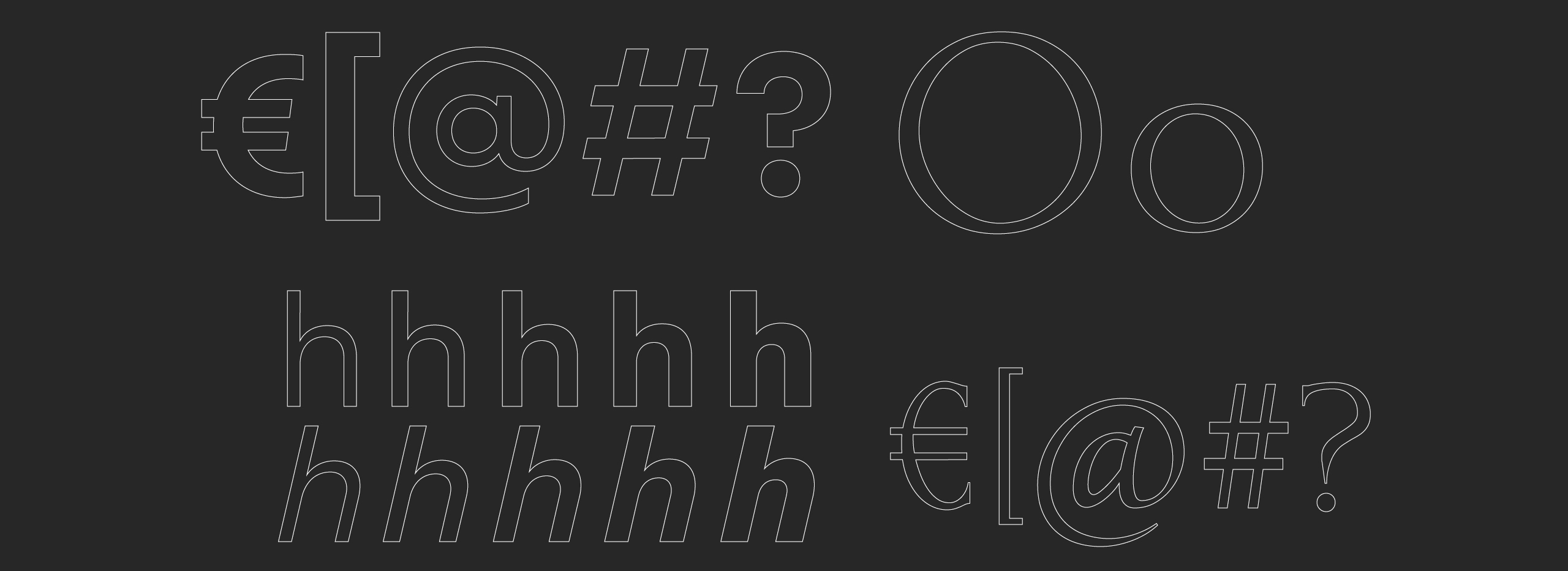
Typography
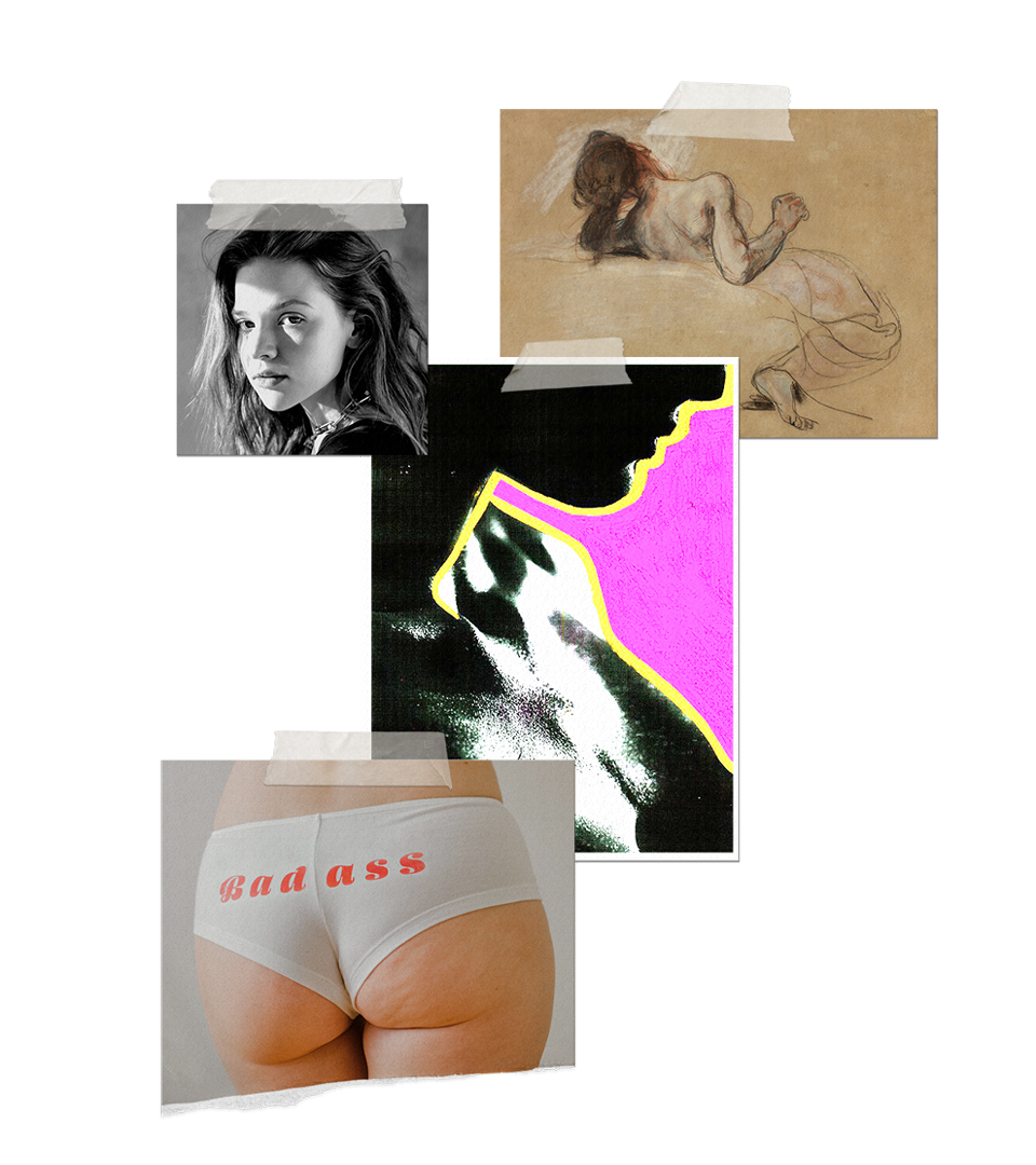
Expanding Inspiration
Expanding Inspiration
We wanted to make sure that everyone or everything can be your muse. To maket htis clear we choose to take two Types and use them in a kinetic type of way to be able to use as much of the font as we can.
We wanted to make sure that everyone or everything can be your muse. To maket htis clear we choose to take two Types and use them in a kinetic type of way to be able to use as much of the font as we can.
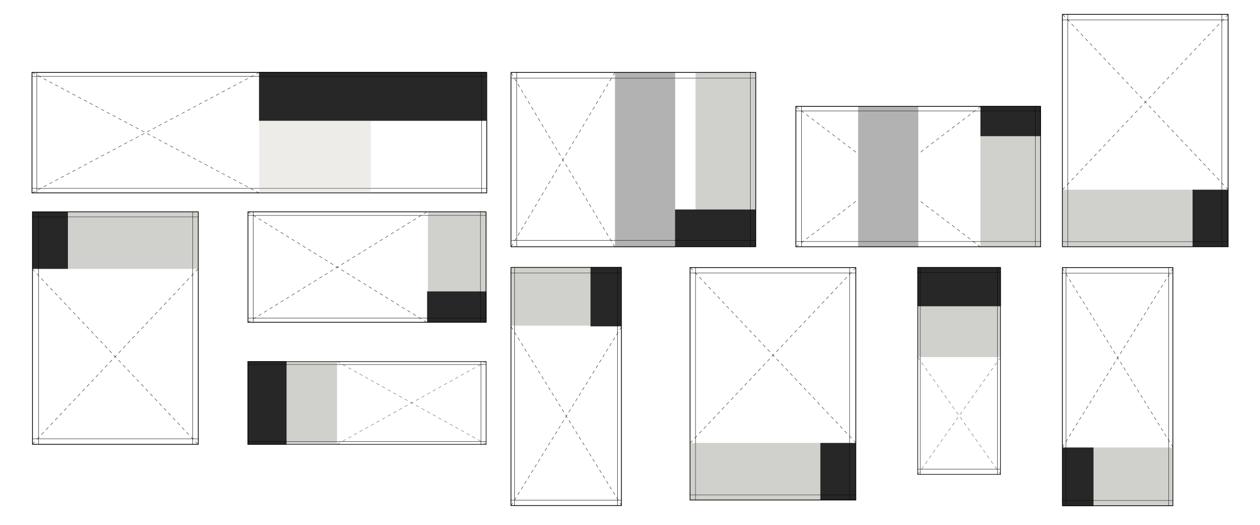
To put all these aspects into one Layout we decided to develope a Stack System, which will allow to put diffrent messages in a flued layout system. That way the brand can stay relevant in every chanel.
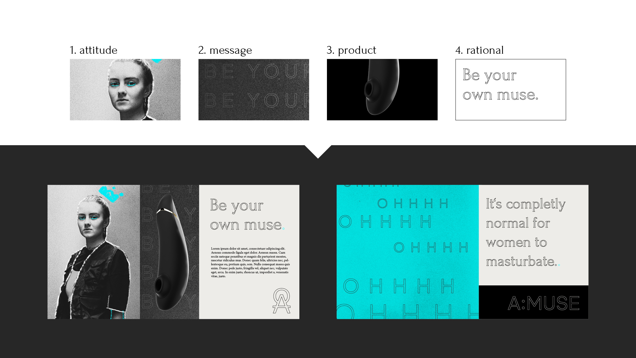
We declaired following 4 Key Asspects.
To put all these aspects into one Layout we decided to develope a Stack System, which will allow to put diffrent messages in a flued layout system. That way the brand can stay relevant in every chanel.
We declaired following 4 Key Asspects.
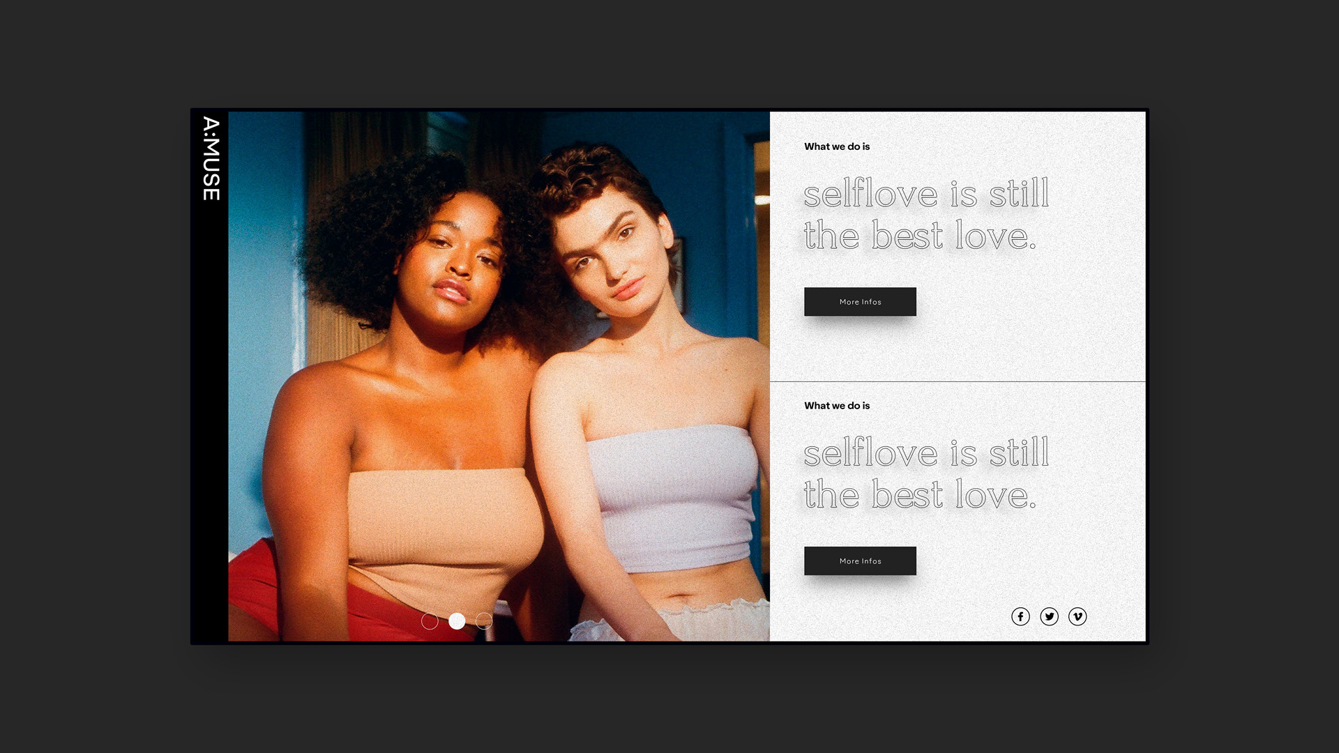
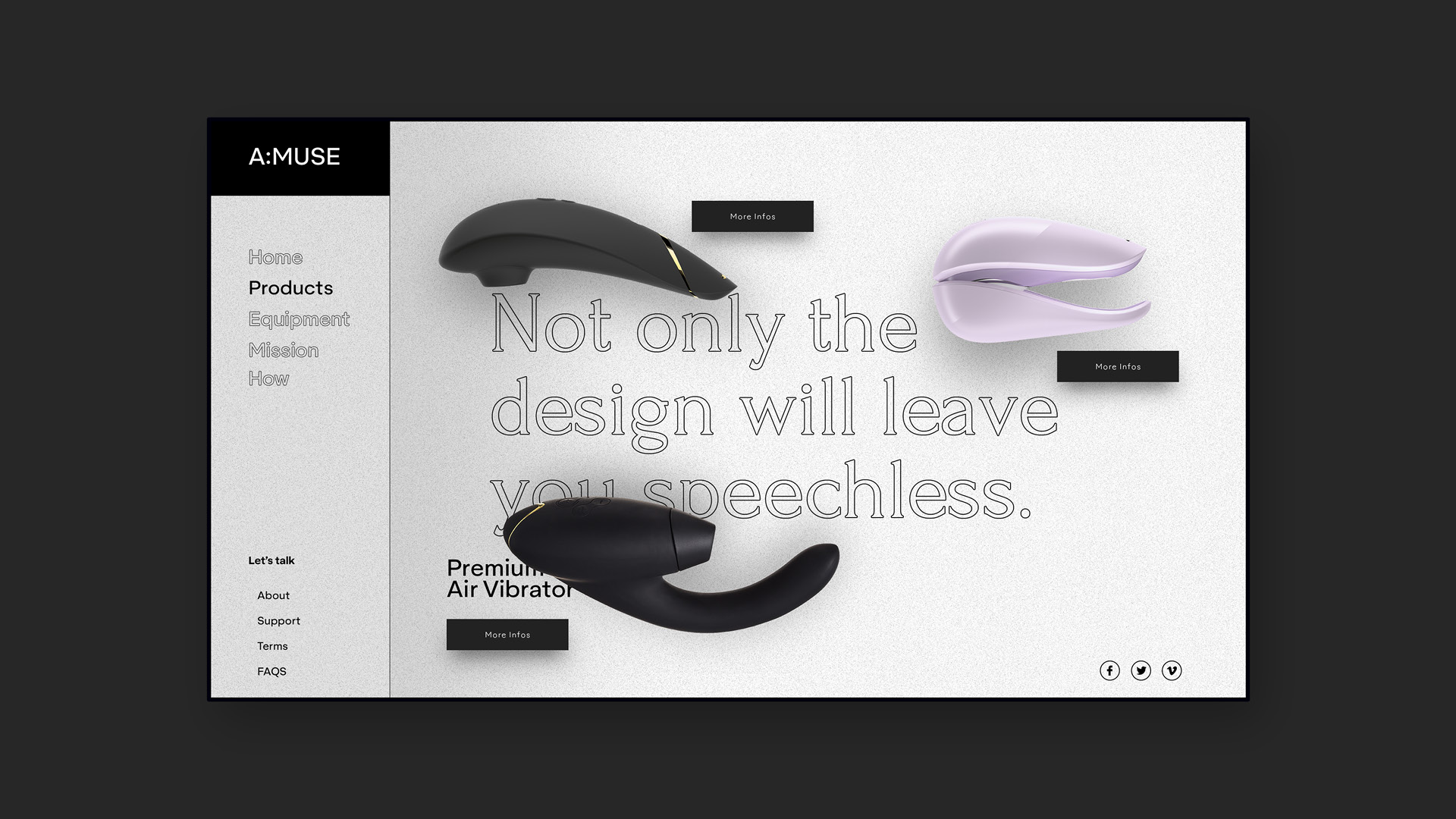
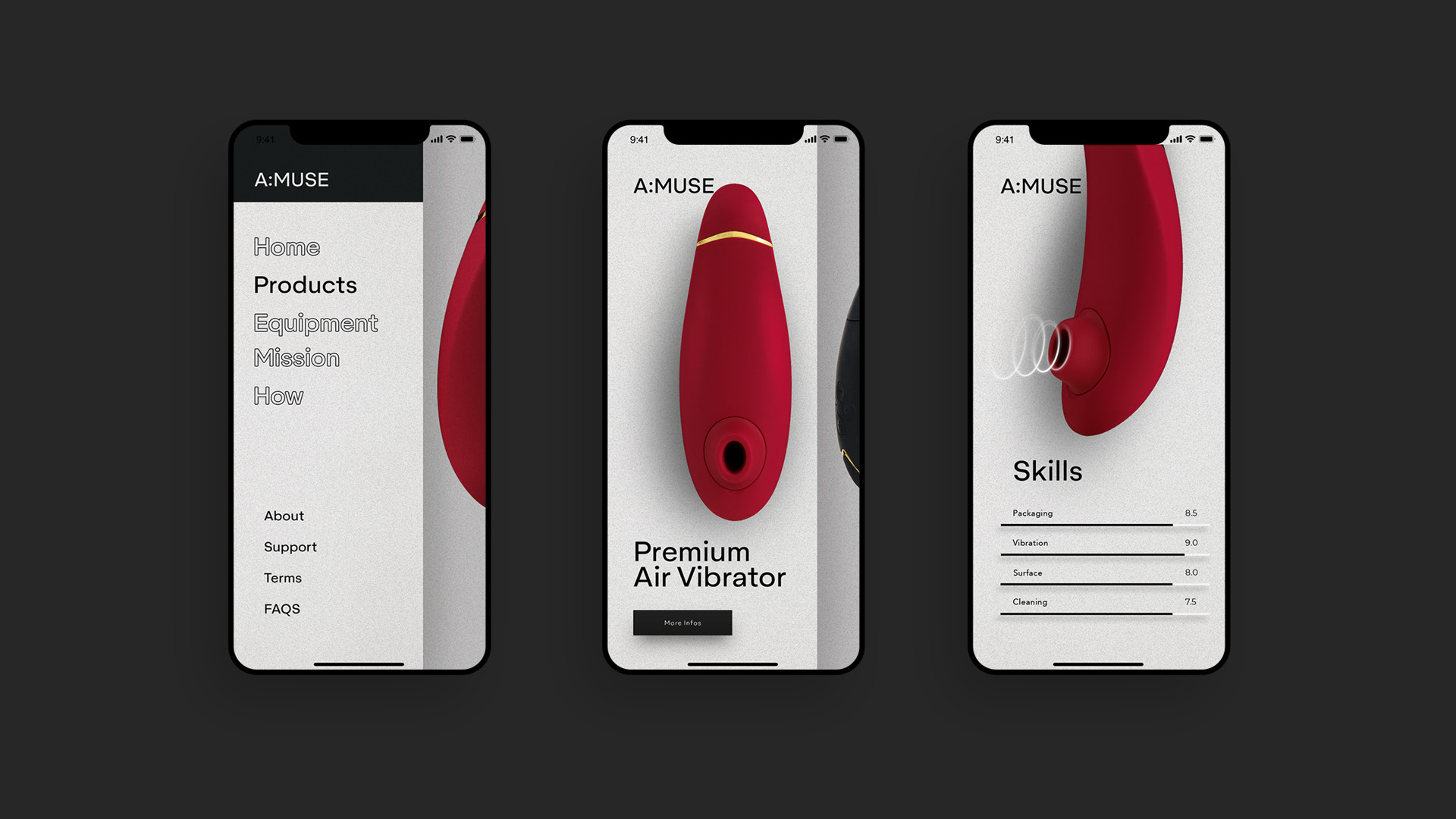
This layout continues on one of the main products of the brand, the hompeage. We wanted to highlight the products in every detail. The shop had our main focus.
This layout continues on one of the main products of the brand, the hompeage. We wanted to highlight the products in every detail. The shop had our main focus.
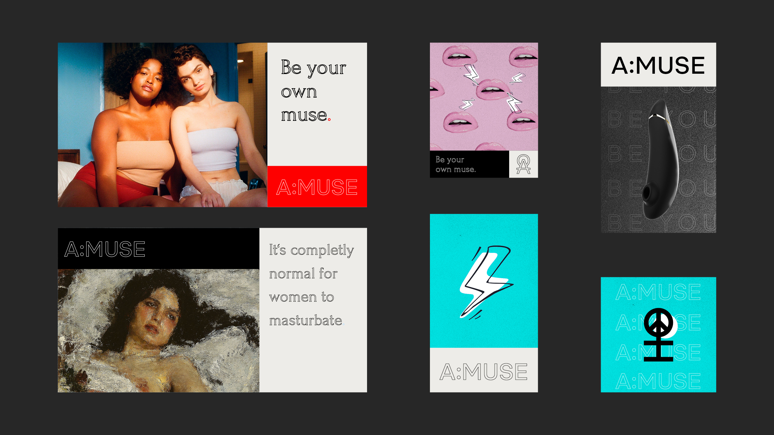
Bold Elegance.
Bold Elegance.
We developed a brand language that's fearless yet sensual, utilizing typography to its full potential across every communication channel. Successfully conveying our important messages in a playful, elegant, and distinctive manner.
We developed a brand language that's fearless yet sensual, utilizing typography to its full potential across every communication channel. Successfully conveying our important messages in a playful, elegant, and distinctive manner.


Packaging
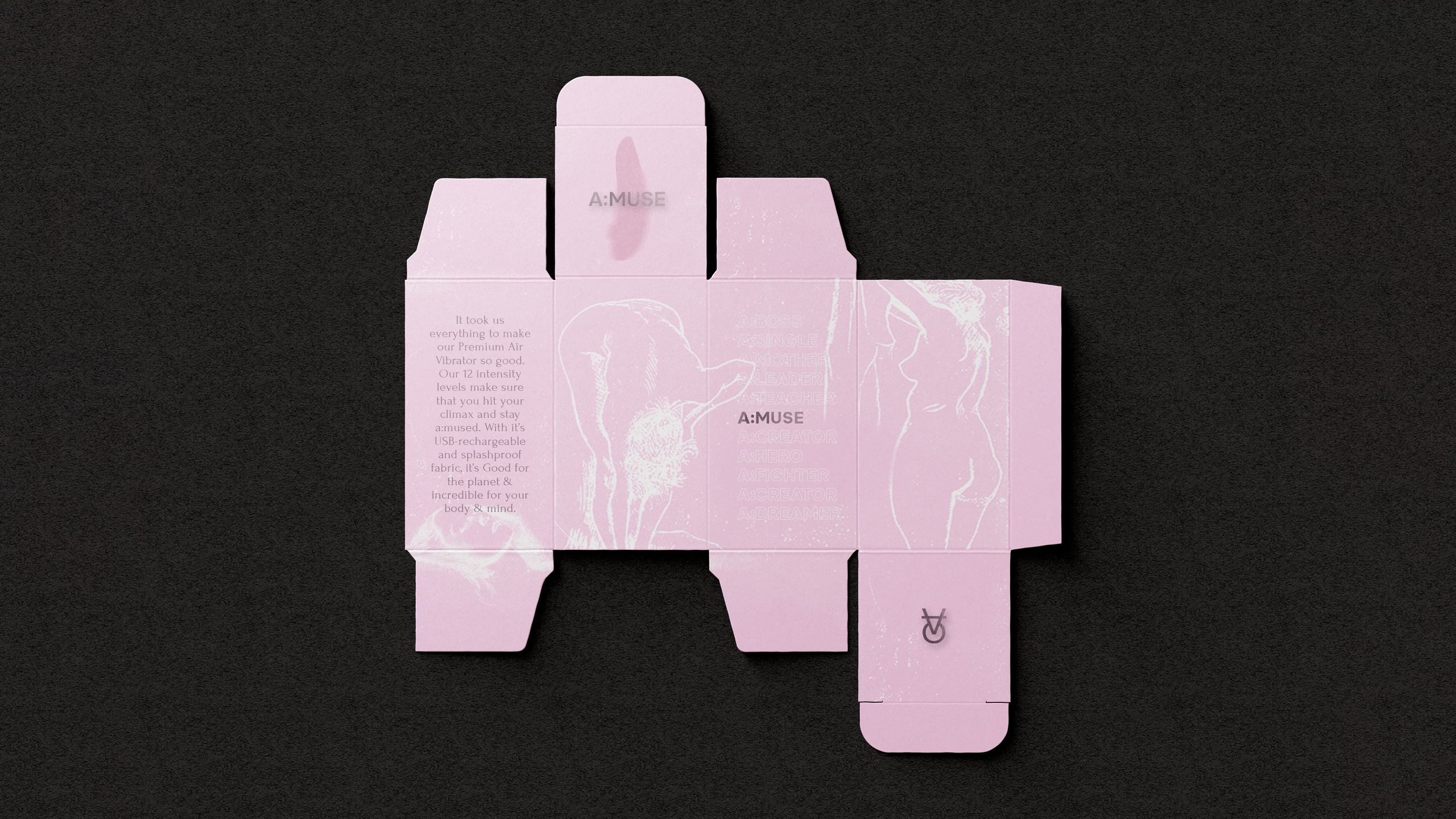
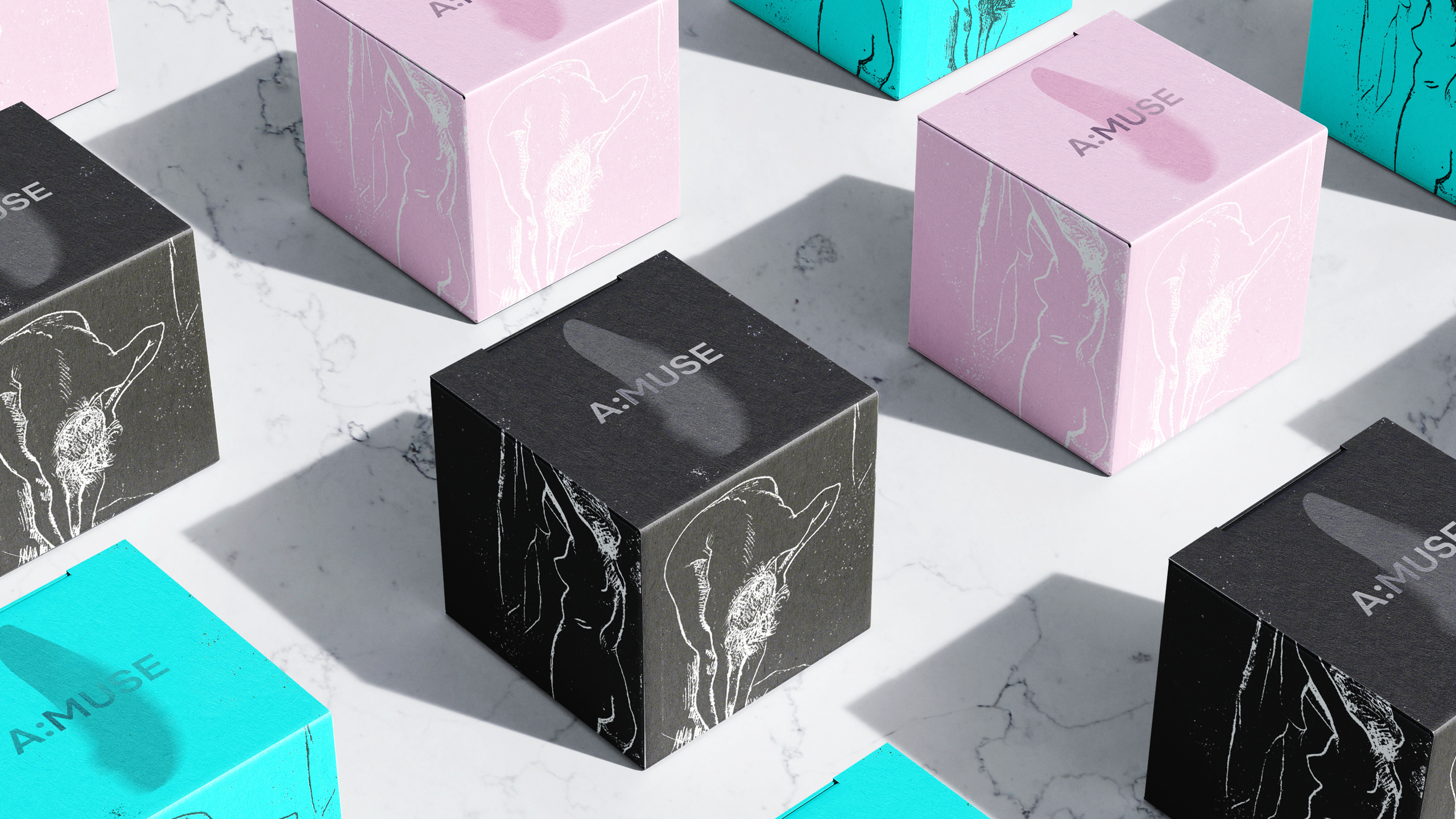
Enforcing Premium Aesthetics.
To underline the premium aesthetic we also had to come up with a way of integretaing the same approach in the packaging.
To underline the premium aesthetic we also had to come up with a way of integretaing the same approach in the packaging.

Want to create
something?
Want to create
something?